UX WRITING CASE STUDY
Snarky Puppy
(A Cocktail of influences)
PRODUCTS
Dedicated Mobile App
ROLES
UX Writer
Content Designer
TOOLS
Pen & Paper
Ulysses
Figma
METHODS ADOPTED
Competitive Audit
Drafting
Content Minning & Design
Conversation Design
Wireframing & Prototyping through Figma
Unmoderated Testing
Iteration
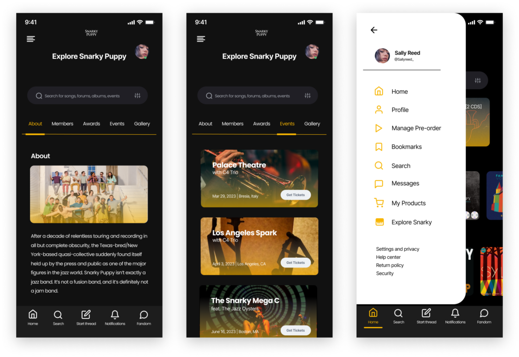
After a decade of relentless touring and recording in all but complete obscurity, the Texas-bred/New York-based quasi-collective suddenly found itself held up by the press and public as one of the major figures in the jazz world. Snarky Puppy isn’t exactly a jazz band. It’s not a fusion band, and it’s definitely not a jam band.
Strategy
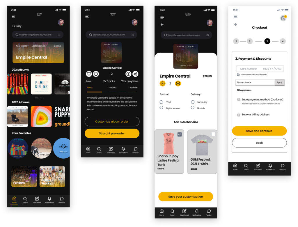
I designed a dedicated mobile app for Snarky Puppy fans and jazz lovers to pre-order their albums and build more connections with other fans. I created all the copy used in the interface.
Why it matters
This app will offer even more exciting features. No app is native to pre-ordering Snarky Puppy’s music specifically or even for the fandom experience.
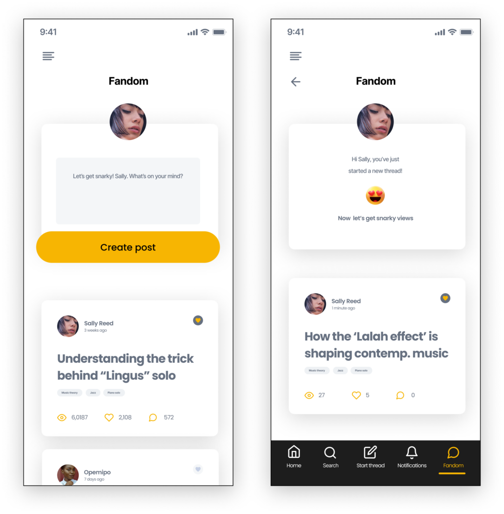
Snarky Puppy users can get more access to the band, build and create a community and share their various Snarky views. They can create threads, chat with other jazz fans, etc.
Motivations
“I’m new to jazz. But I love Snarky Puppy. The interesting thing is that they make me sense. I can feel it in my body. It moves my soul.”
“I think a lot of people are motivated by being the first to have it. If it’s something rare. Being a part of this musician’s special release means a lot to me.”
“The biggest things when it comes to jazz will be discounts on concerts/free merchandise, direct access to interacting with the artists: some form of co-circle, meetup or chatting.”
UX WRITING
Steering the wheel: My UX Writing Process
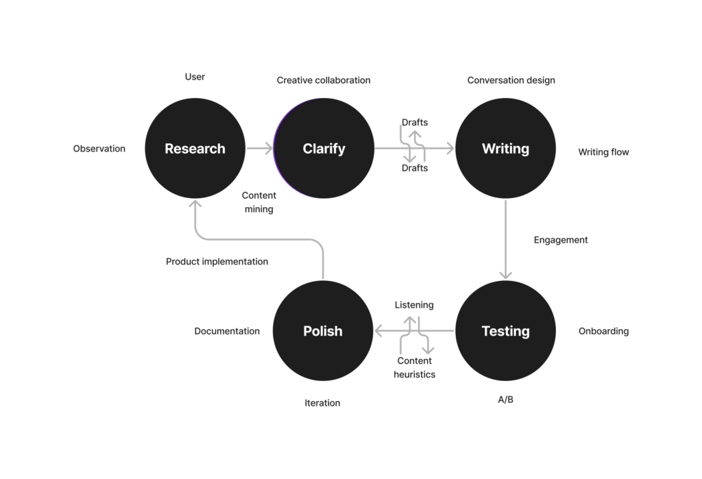
This particular project took a turn. As much as my notes remember, these were the highlights of my process. I’ve used this again and gained confidence in its fluidity.
“Every great design begins with an even better story.”
Lorinda Mamo
USER-CENTERED WRITING
Mirroring Reality: First Things First
80% of the potential users I interviewed were Snarky Puppy listeners and others are jazz enthusiasts. They use Spotify and would want to use an app that is significantly dedicated to their favorite jazz ensemble.
Minning content from Snarky Puppy’s social media pages and other different sources on the internet helped generate a framework to work with. Through user interviews, I was able to read into the minds of my users and make them realize what they need, but actually don’t know that they need. They spoke of their intentions and used keywords that address these specific needs.
In addressing user-specific needs, I was able to keep the focus on the design goal, keeping it a user-centered writing
Name matters
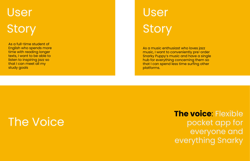
After a series of research-design informed decisions, I decided to stay with the eponymous name, Snarky Puppy for the app since it’s what users will be able to remember quickly and it’s in diligence to the original name. Referencing the user stories ensured that the copy is reflective of that. I went on to create the in-product content, onboarding copy, and the voice of Snarky Puppy. Across each of these phases, documentation was essential.
Writing for humans: Onboarding words
Understanding Snarky Puppy and their brand’s tone and voice was instrumental too. After conducting research and testing, I discovered that the users are playful and witty. Hence, impacting my copy choice. The goal was to make sure the copy feel relative to the users’ language, expectations, and expressions.
Writing with clarity, hence, I had to facilitate effective conversations between the Snarky Puppy dedicated app and its users through playful titles. The copy’s goal was to keep the user engaged and assist them in settling into the experience.
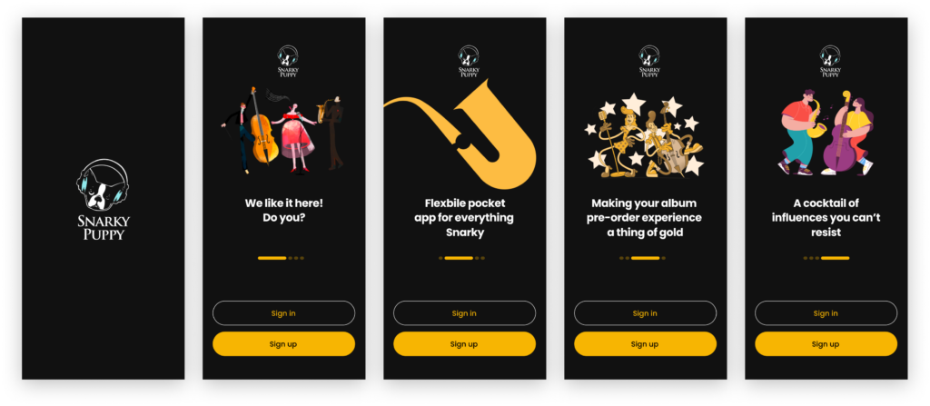
The users will connect the following words, which they already understand.
The UI: In-App Copy
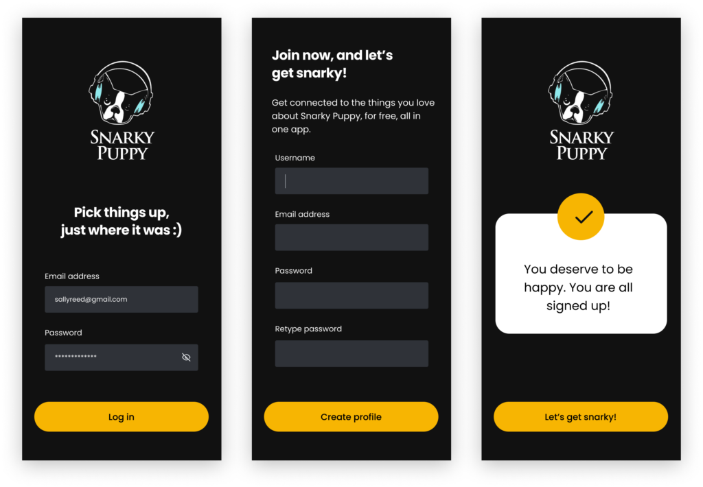
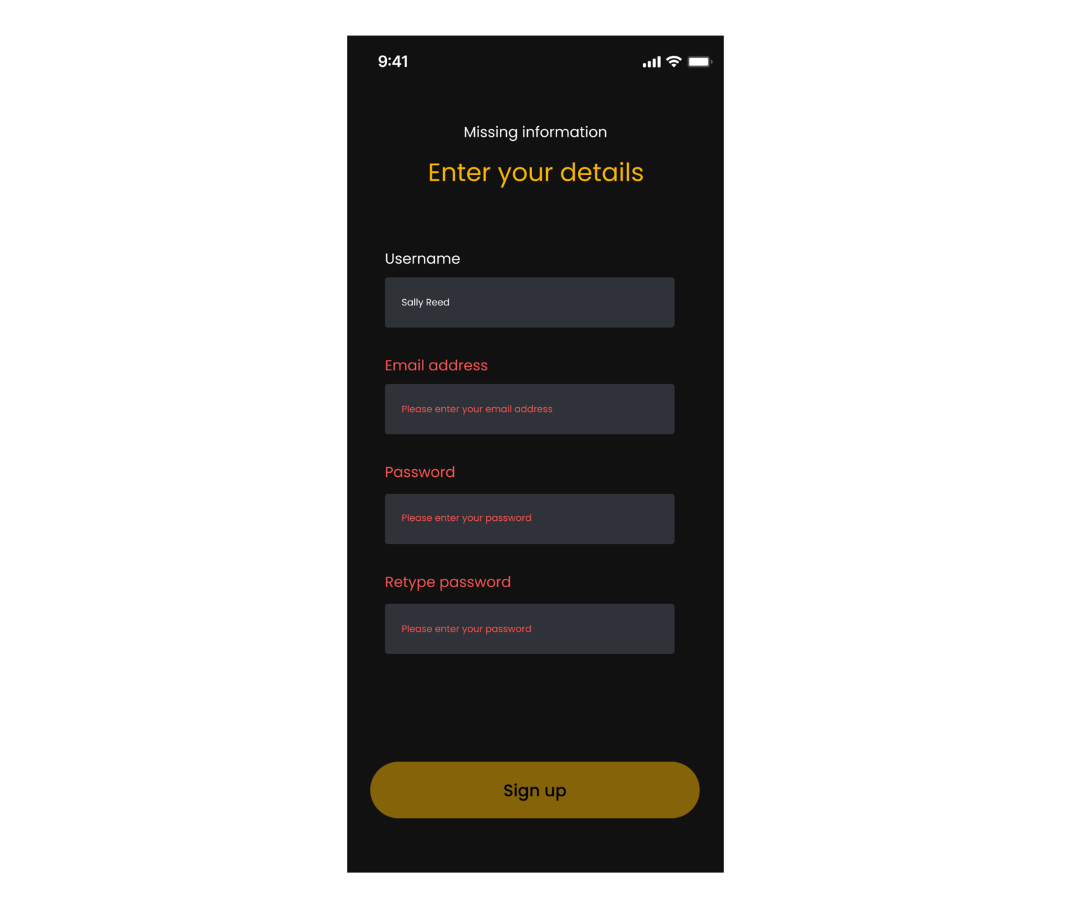
Login and Sign up screens utilize headlines and field labels that explain the value prospective users will get in simple and clear language: ‘getting connected to the things they love about Snarky Puppy, for free, all in one app.” The titles are invitational. The signup confirmation message reaffirms the value awaiting users.
Fandom
The forum geared towards increasing the users’ experience and creating more community
Values

Next steps
I had a great time curating the copy on this experience. The writing process I utilized here was mind blowing and eyeopening. I learned a lot about how drafts, no matter how rough can offer an insight or two. Writing for clarity and consistence is an iterative process, and I look forward to seeing this product go from concept to launch.