Walden Pond is one of the leading independent and local bookstores in the East Bay. Currently serving the community, authors, artists, and book enthusiasts since 1973. Customers can browse books online and also walk in to pick them up.
Strategy
I conducted a content audit on the current website and restrategized a new information architecture. These changes address usability and content and improve interaction with the product and the brand.
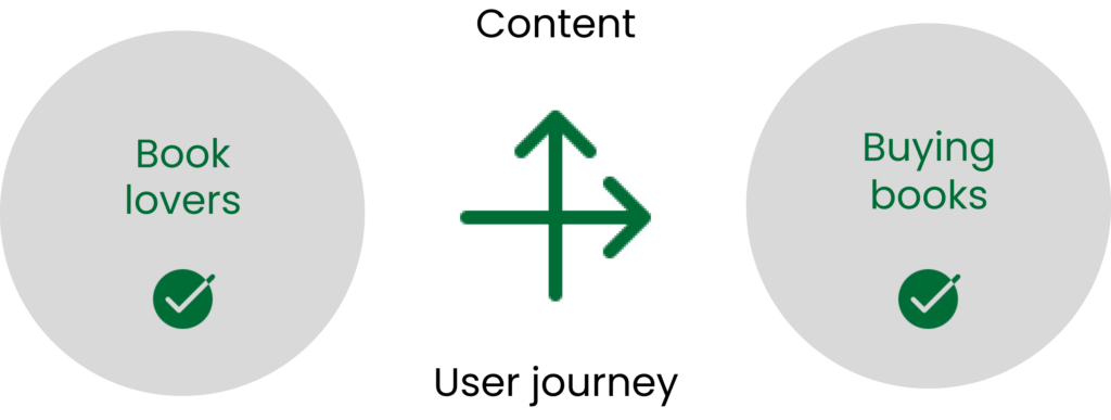
More than engagement
Through research and studying this brand’s history, its users want a clear, simplified, and more intuitive experience through an optimized user flow. This would ensure that Walden Pond has its content organized, and ultimately get more customer engagement.
UX WRITING
Market Needs: What’s the Message?
That big giants like Amazon have made walk-ins to independent bookstores only a thing for book enthusiasts is not farfetched. However, local artists and some book lovers still relish the immense pleasure that is gotten from visiting the websites of local bookstores and ordering books through them, and having them delivered to them from the comfort of their homes.
As a signpost for directions or publicity for new books, measuring orders and sales, bookstores also rely heavily on their web presence.
UX WRITING
Why does it Matter?Identifying Opportunities
Voice is everything. And it is important to speak in the language of Walden Pond Book’s users. Feedback from some book lovers confirmed the hypothesis that the right words on Walden Pond would make digital book purchases interesting. What needs to be done?
MAPPING THE POSSIBLE
The Endless Journey
For book enthusiasts, the communion with books is an exchange that has no expiry date, hence, every opportunity to make it worth it should be prioritized.
THE TALK DOES IT
Keeping the Conversation Ongoing
I ensured through rewriting the copy that the language was accessible, clear, concise, and purposeful. The end goal: the interface speaks to the customers in a conversational manner.
Simplifying Things Through Language
Language, when applied effectively goes unnoticed; it just works as it should. Here are use cases where language becomes focal.
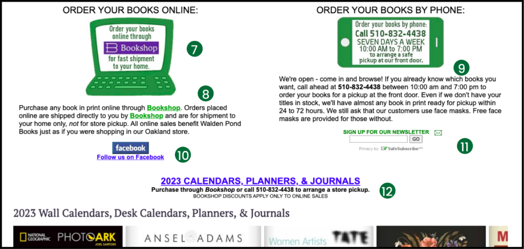
Before
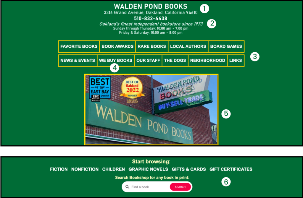
1. The logo should be defined as a return point.
2. As a convention, emphasizing the address is important to bookstores, but the menu items should take the spotlight.
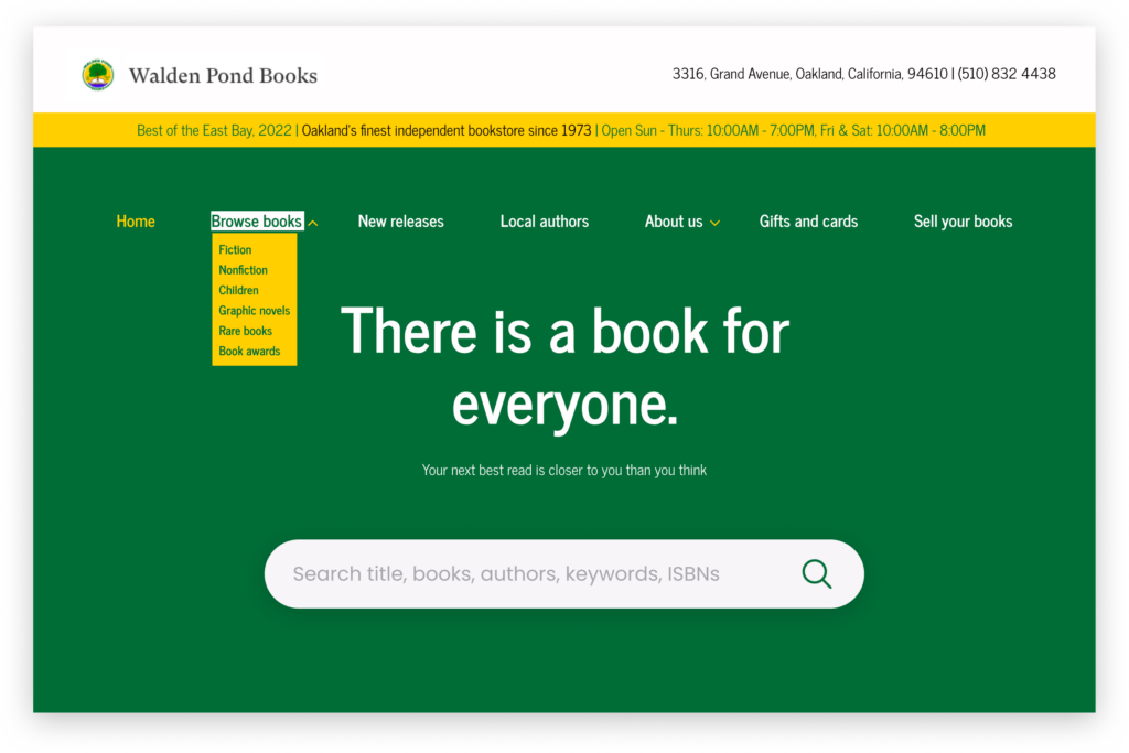
3. The menu needs to be defined. Some menu items can be nested with a drop-down menu. More so, Links, neighborhood, and board games can be reorganized.
4. This menu ‘We buy books’ would function effectively if reworded. The action is not clear, even though it’s directly addressed to customers. We buy books could become “Sell/trade your books” or more so come as another content block.
5. The image is not needed. It takes up too many spaces and reduces the real estate for above-the-fold content.
6. The search functionality should come earlier. The categories of Fiction, Nonfiction, Children, Graphic Novels, Book awards, and Rare books seem to appear like new menus. They can rather be nested under ‘Browse books’. ‘Gift & cards’ and ‘Gift certificates’ could also be nested under a parent menu or be a stand-alone menu item. Let’s see what happens.
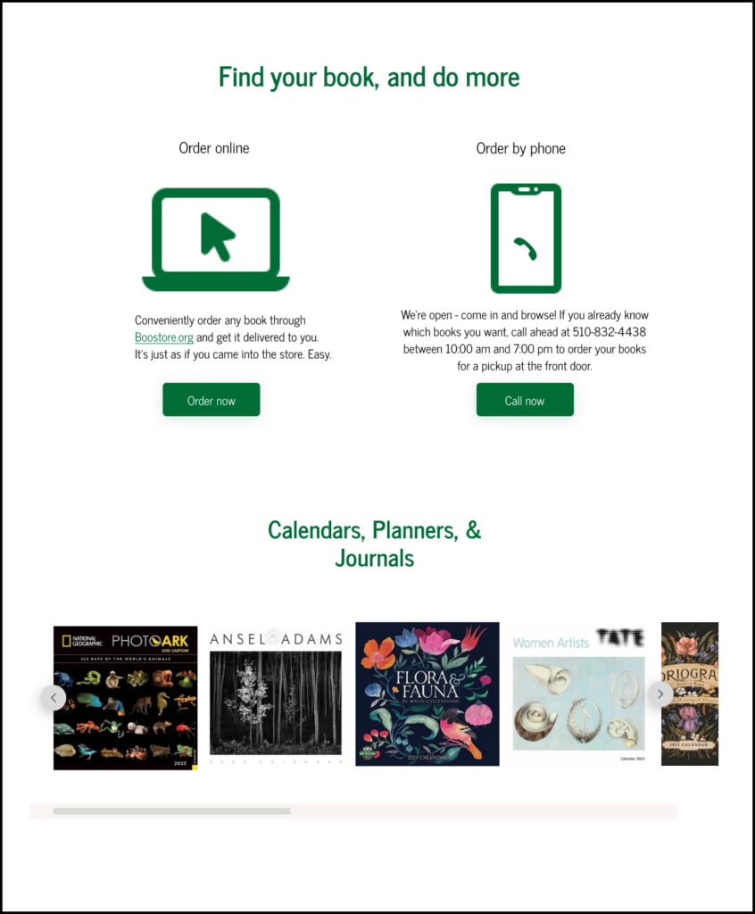
After
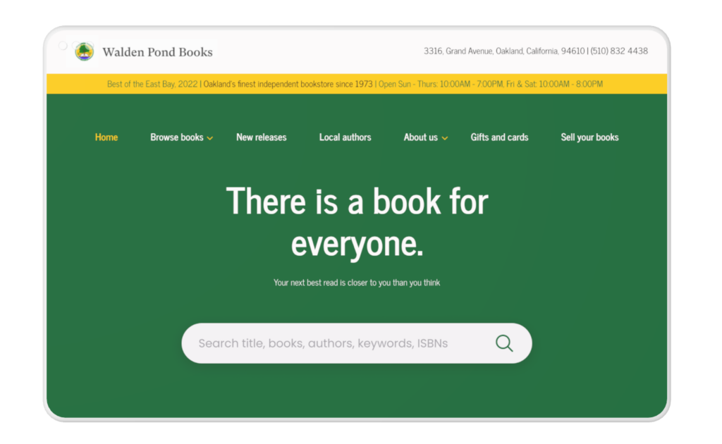
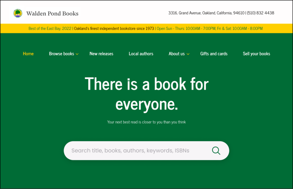
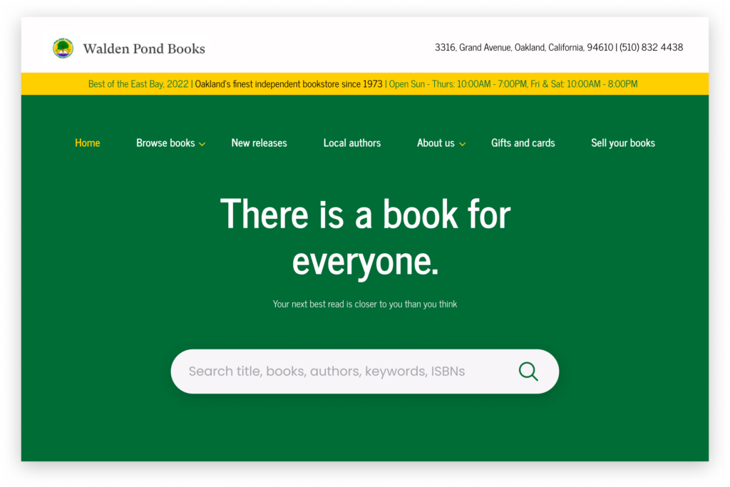
After addressing these problems, the redesign highlights the logo, contact, and address. Also, there is an alert of the tagline and opening times.
Through information hierarchy and architecture, the important items are prioritized. ‘We buy books’ rewritten as ‘Sell your books’ would indicate an active voice, hence, triggering customers to know its purpose.
After a series of drafts, I finally settled for this headline and description which would increase user action, give direction, and also help drive the conversation with the website.
My initial copy idea for the search bar placeholder text was using a question: “What do you want to read?” but I kept ideating. The new search bar is bold and provides extensive keywords through placeholder text to guide and motivate the user towards an action. In the original design, it is below the fold, hence, ineffective.
Consistency is prioritized.
Before
7. On mouse enter, “What are you waiting for? Click now to enter Bookshop” appears on the desktop screen. Upon leaving, the current copy shows. Both are repetitive, wordy, and ambiguous.
8. Copy is repetitive since the screen is saying the same thing. One hyperlink would suffice.
9. Copy is repetitive. Although conversational, it could be clear and concise. A CTA button will enable users to take suitable primary action, hence, purposeful.
10. Although necessary, the CTA can be housed either as a sidebar item or moved to the footer.
11. The presence of the newsletter signup would distract the user from the intended journey of ordering a book. This could be placed in a more strategic place. The action word, ‘go’ isn’t conversational but robotic.
12. The title here needs to be emphasized and the description simplified for usability. Since the bottom text just before the carousel says the same thing, it might be confusing to customers.
After
I developed titles/subtitles that give direction and which is clear for the user on the options available. The descriptions are modified to be concise and conversational. Ultimately, the CTA button would aid the continuity of the user journey.
Users have more control and freedom with choice through a simplified decision-making process. This also reduces the time taken to perform a task.
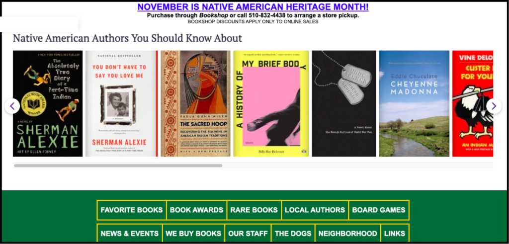
Before
13. There are inconsistencies in text style/case. More so, “November is Native American Heritage Month” would work better as a notification rather than a title. The copy needs to be clear and purposeful. A dialogue box can instead pop up when the user hovers over the title. This will reduce cognitive load.
I simplified the first title and developed the next, and the search functionality is also emphasized as a call to action.
Before
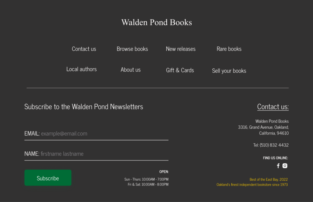
14. This footer needs to be defined.
After
I brought the same menu items on the hero page to the footer and redesigned the subscription form. I also added a ‘contact us’ and social media profile.
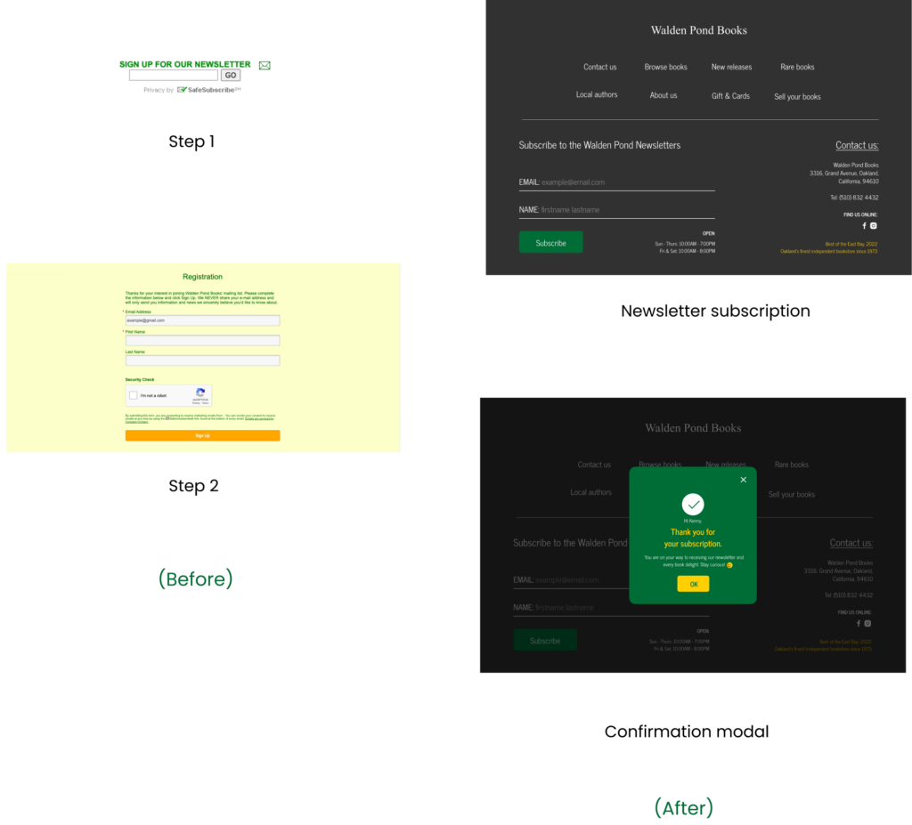
The Little Things that Count: Newsletter Subscription
In the current user flow, when the user submits their email address here, they get redirected to a new page where they are required to fill in their email, name, etc afresh. This would frustrate the user since the action is repeated twice. The extra step can be avoided.
Two key changes here were to provide input field text guides, add a prominent subscribe button as well as create a confirmation message which informs the user of the action they’ve just taken and hence, system status.
WHO'S TALKING?
A Book for everyone: Crafting Voice
LEVERAGING FUNCTIONALITY
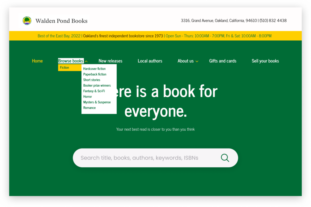
Seeing The Bigger Picture: Navigating the ‘Browse books’ Menu
Using the menu nesting functionality
Unpacking the ‘Browse books’
Displaying its nested children
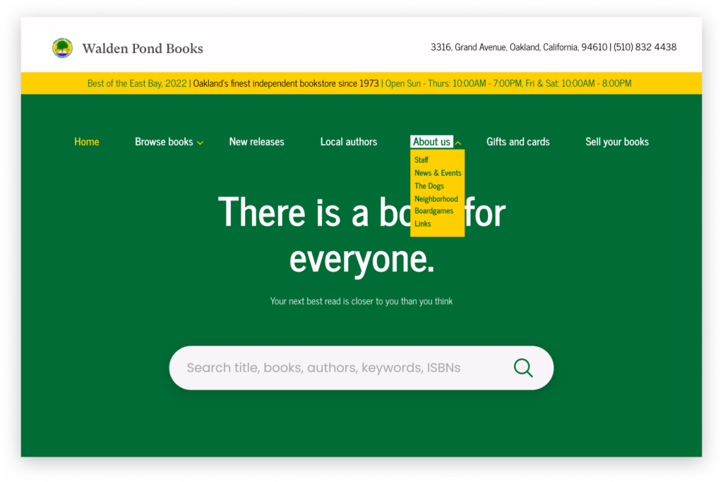
Seeing The Bigger Picture: Navigating the ‘About us’ Menu
Using the menu nesting functionality
Displaying its nested children
The behavior expected for the nested items under ‘About us’ is that it would open up on a new page. The system is also very flexible for you.
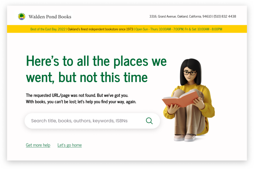
And for errors: 404 Page
Taking on a popular literary quote, the headline, as well as the description is clear, shows empathy and also utilizes humor to make the ‘serious’ less serious. The subtitle provides more details about the situation of what’s happening.
This design solution creates engagement and is purposeful as it points users. It also gives them the choice to take the next steps: searching over again, this time with more care, or getting more help/going back home through the linked buttons.
Measuring Success through Heuristics and User Testing
A heuristic evaluation was conducted and the new design was tested amongst four participants inclusive of book enthusiasts and two local authors. These designs prevent pain points. Jakob’s law was applicable to this redesign since users have a familiarity with the way the websites of independent bookstores should look and operate. Two important KPIs were: the use of search functionality and the time on task.
Key Takeways
I learned that customers want to be engaged. And when things are in the right place and the experience is more human, it becomes easy to engage them. The likely edge cases were addressed and the user journey was made more effective. This redesign will be a totally unique, interesting experience.
I discovered that the little details, when taken into consideration will determine if the user is put on a happy path. I gained more insights after testing and the possibility of redesigning other pages. Overall, usability issues were addressed and this design will make users feel good about themselves. Book purchases are about to spiral.
Prototypes
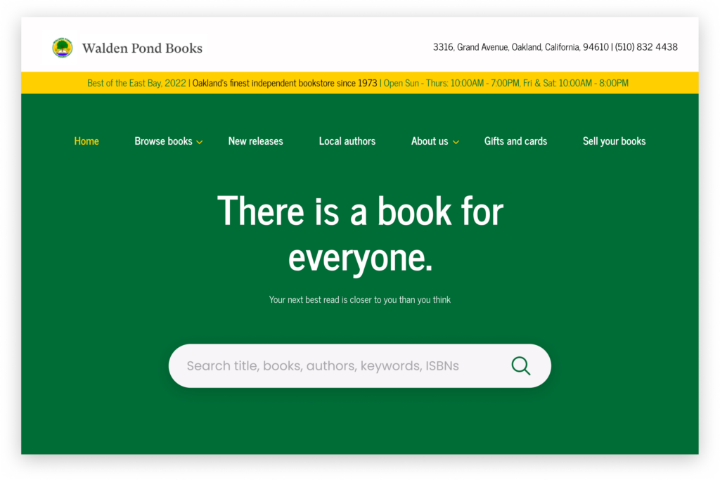
LANDING PAGE
ERROR 404 PAGE
DIALOGUE BOX FOR WHEN USER HOVERS OVER 'NATIVE AMERICAN AUTHORS...'