Susby is a marketing agency, based in the SF Bay Area, offering marketing and social media services. Their goal is to connect businesses to their target audience. They provide customized strategic solutions to get business owners and their businesses to make the most informed decisions.
Approach
Relying on best practices of content and strategy, I learned and conducted a content audit on the current website and redesigned the experience — restrategising the language and shaping the brand voice. I was involved in creating new content for the interface and rewriting existing web content.
The Big Picture
From the research conducted, the content on the website needs to be organized and optimized to meet content usability. This is UX-focused writing that meets and exceeds customers’ expectations.
"The next big thing is the thing that makes the last big thing usable."
Black Ross
UX WRITING
Words: Improving & Upscaling Content
Having studied the way Susby’s competitors use words to portray their vision and advance their users’ needs. it was important to address how using the right words would simplify things.
My focus here, and ultimately, for the entirety of this project is not to focus on what’s not working but on what is and can be better. In searching for ways to guide the product experience, the right words are necessary. This will enhance Susby’s goal of telling their own story and furthermore help their clients tell theirs. The brand voice would be strengthened with a more organized content structure. I wrote navigation items, button labels, headlines, descriptions, confirmation messages, etc. One benefit of this is that it becomes efficient to utilize screen readers.
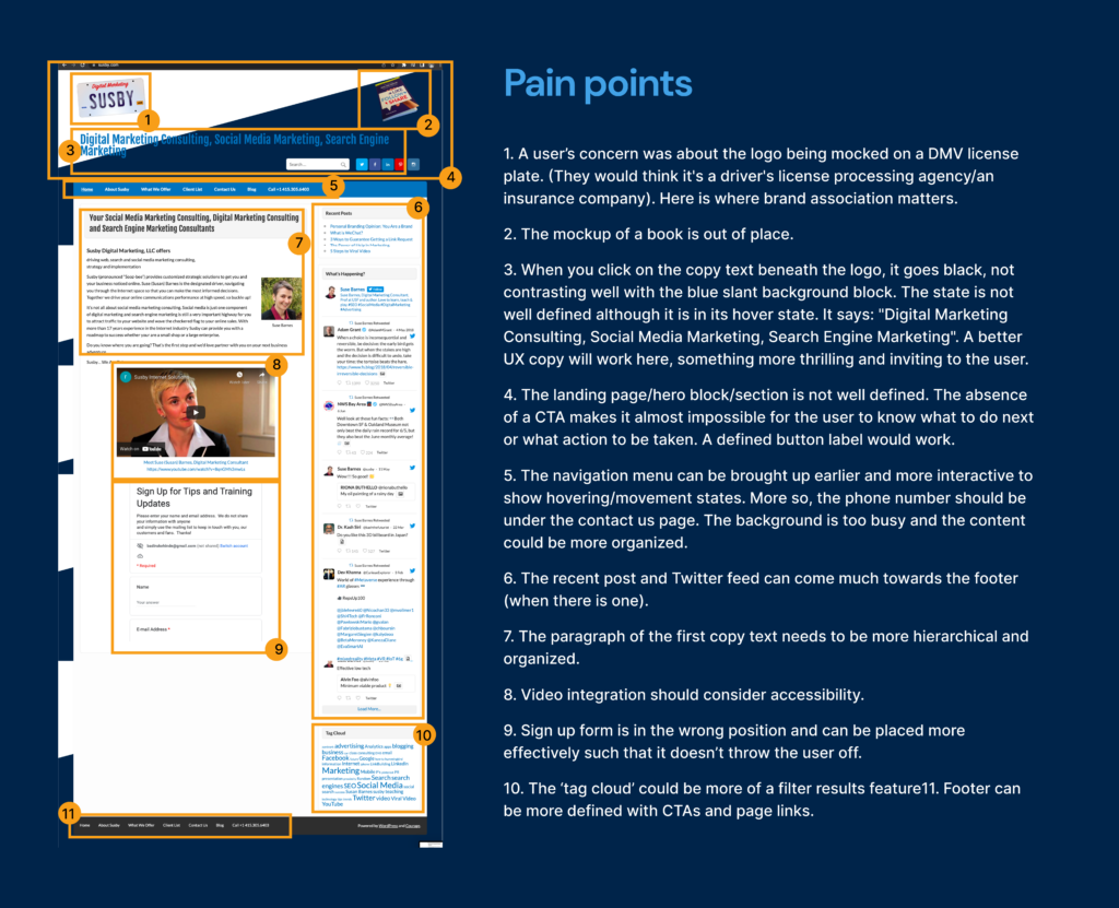
Let’s walk through some pain points:
Actionable content decisions
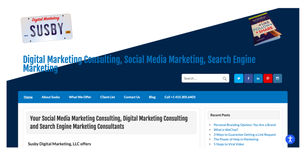
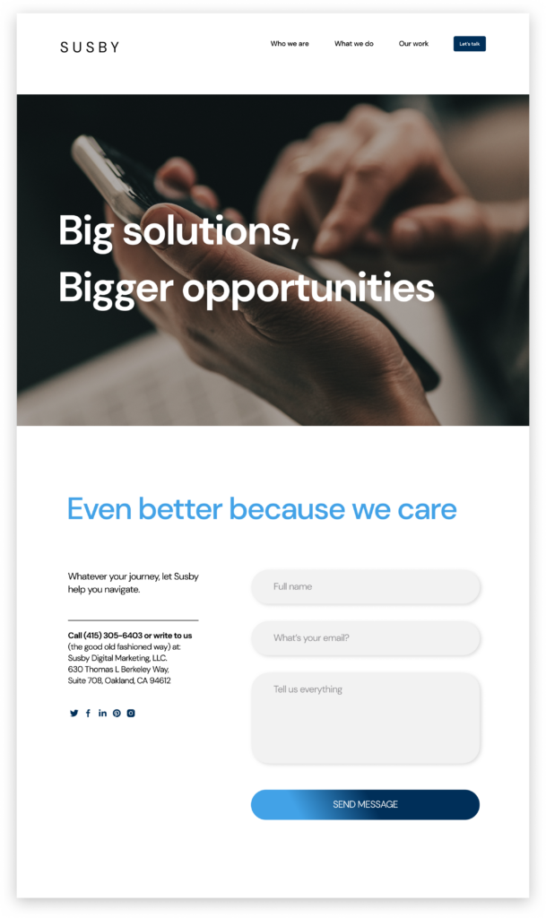
Before
After
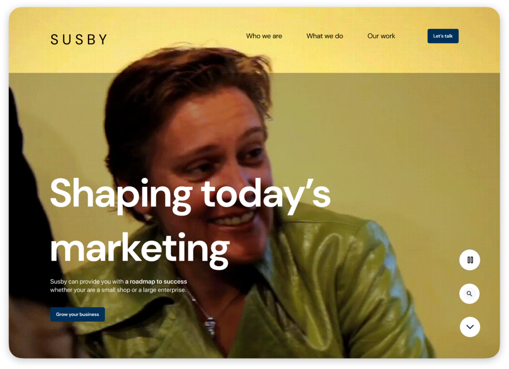
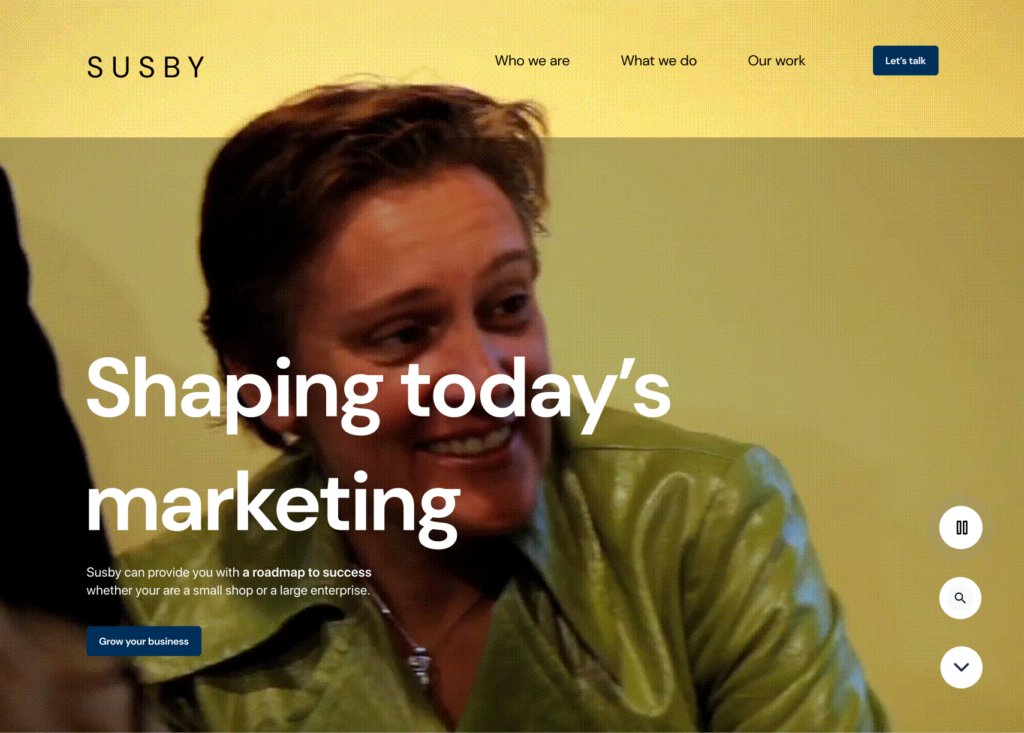
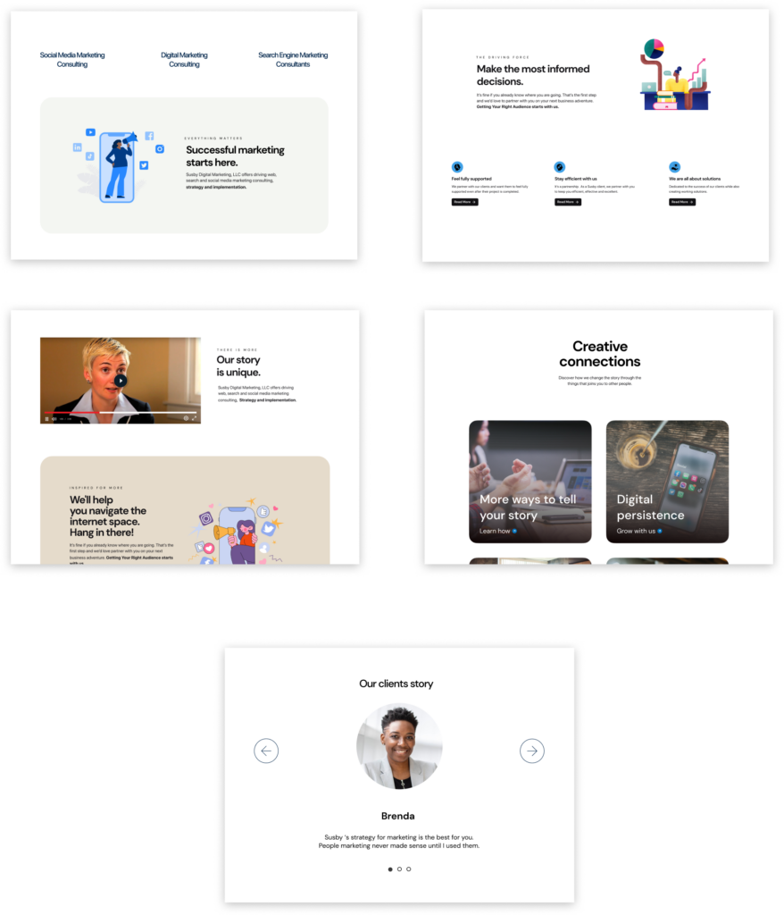
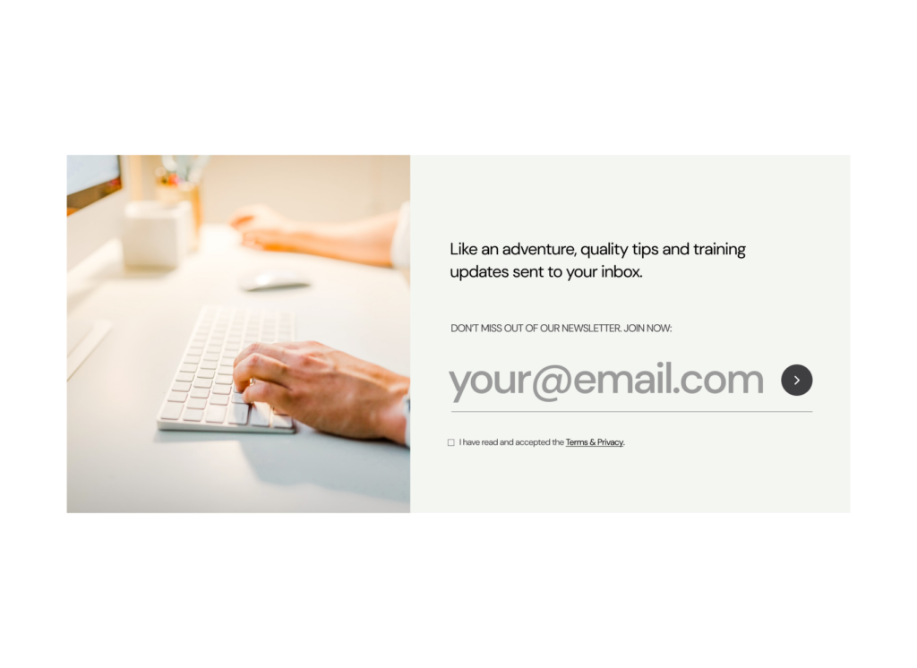
I optimized the landing page to a simplified integrated menu navigation, title, subtitle, and primary CTA button with a copy that speaks directly to Susby’s target customers. This will motivate customers to take action.
Through insights generated from my research and competitive audit, it became clear the importance of crafting simple, memorable, and meaningful text. After brainstorming several options for the headline, I decided to go with “Shaping today’s marketing”, therefore addressing contemporary needs. I also curated new content blocks and the copy that goes on the title, subtitle, descriptions, buttons, etc. This ensured more ways for Susby’s voice to be represented in a clear, purposeful, and consistent manner.
Some refined UI
Before
After
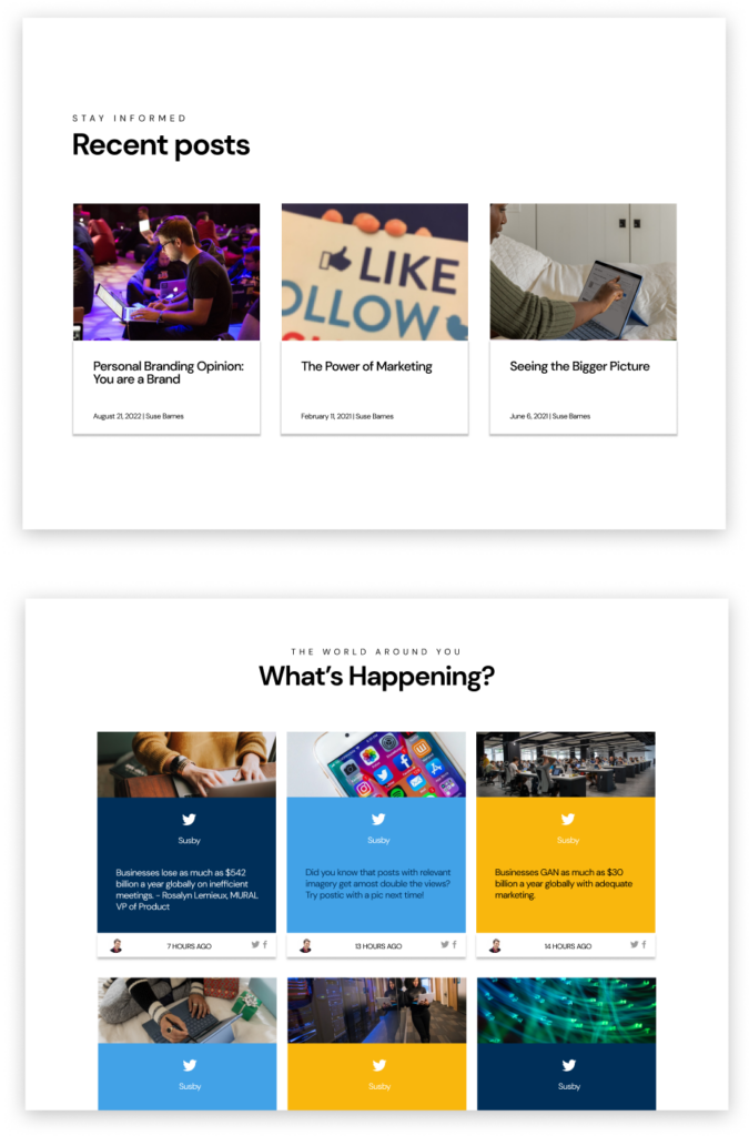
Each post is grouped in grid cards and highlighted in a consistent UI with excerpts from the main posts.
Before
After
Each post is grouped in grid cards and highlighted in a consistent UI with excerpts from the main posts.
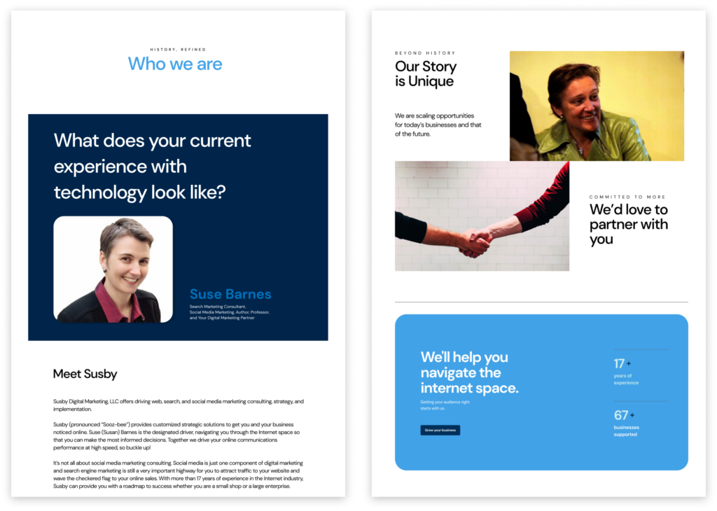
‘Who we are’ page
‘What we do’ page
Before
After
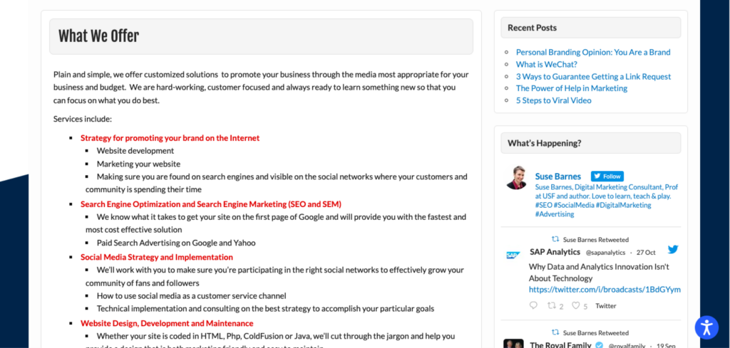
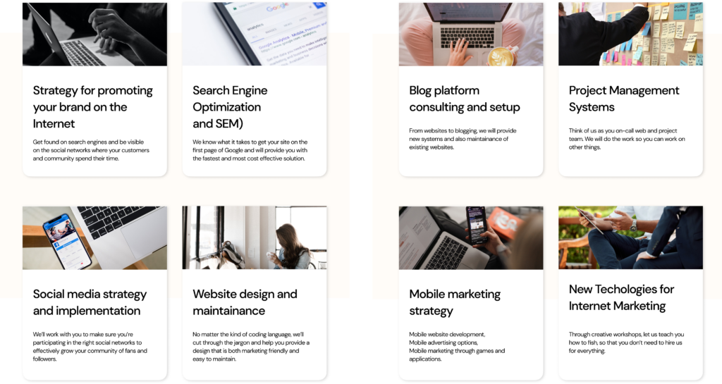
I revamped the various services into cards and highlighted the main offerings with consistent and clear headlines and descriptions. Keeping the content simple was the goal here.
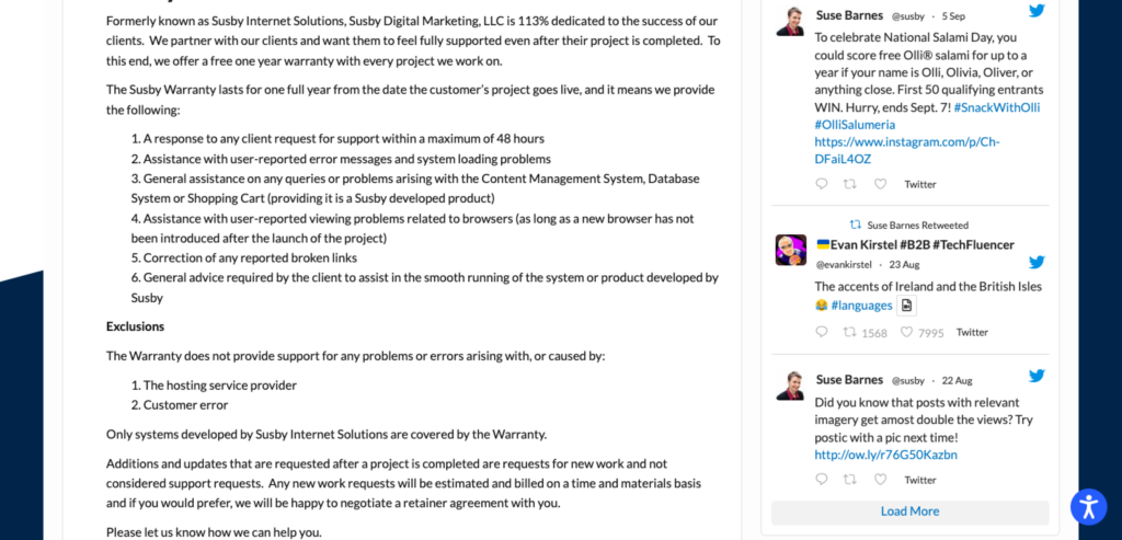
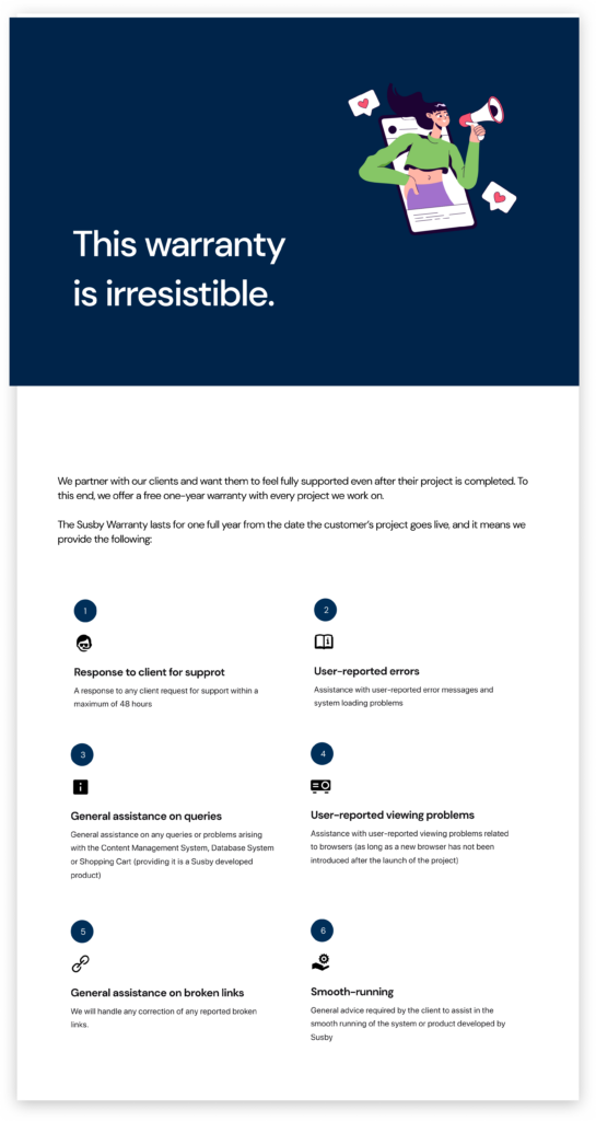
‘Warranty’ page
Before
After
I developed headlines and descriptions to emphasize the warranty available to Susby’s customers. Applying the UX principle of Occam’s Razor, I used the simplest solution to show the whole content while also ensuring to communicate with the user.
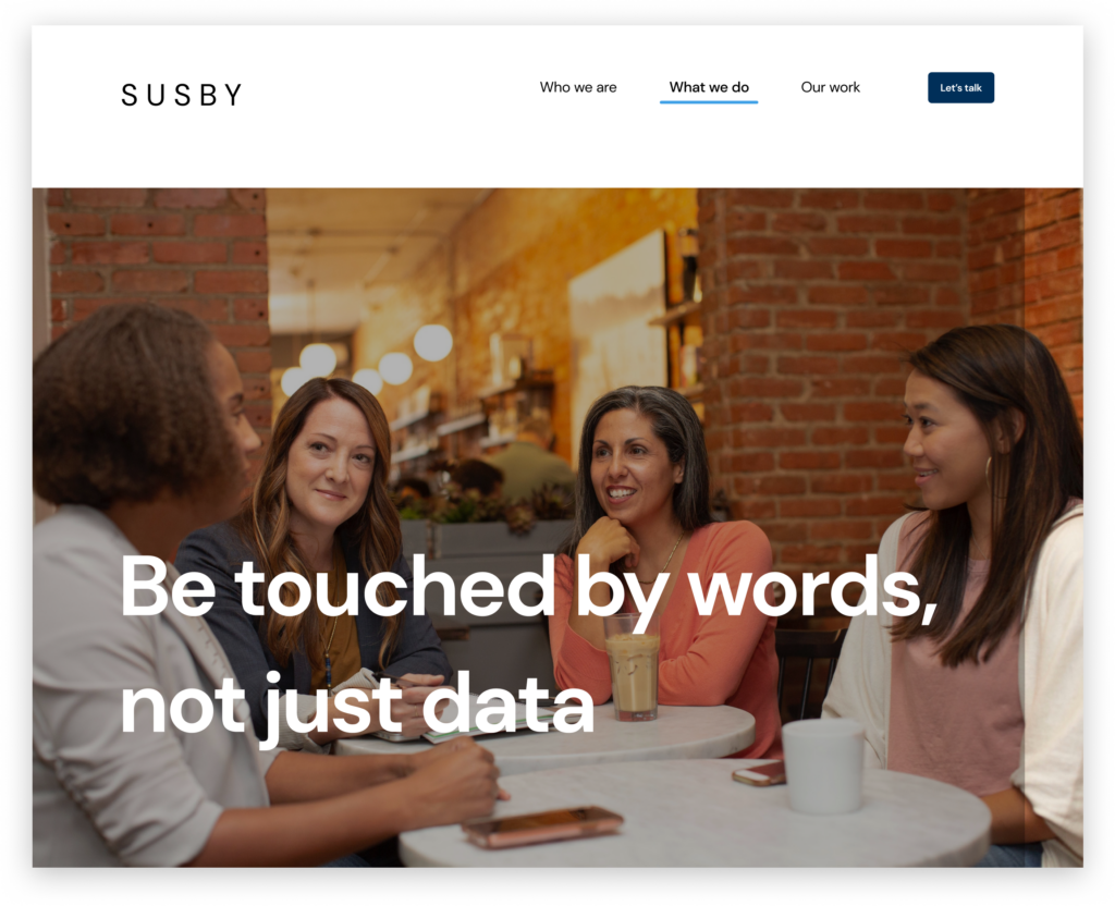
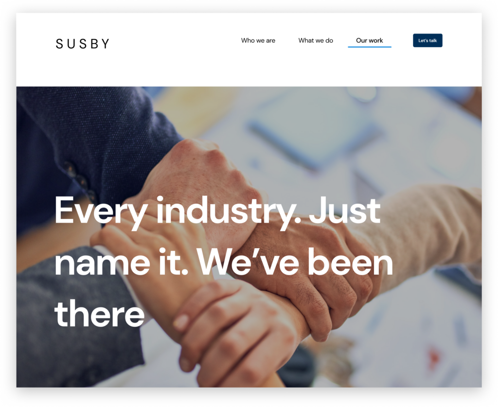
‘Our work’ page
Before
After
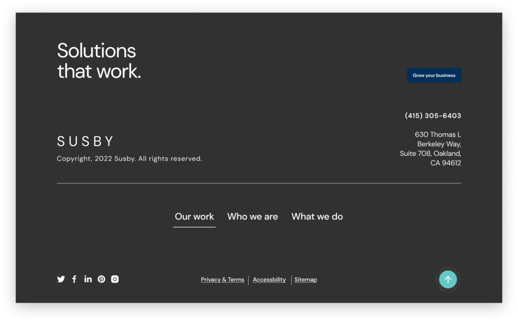
More UI copy
Footer
Before
After
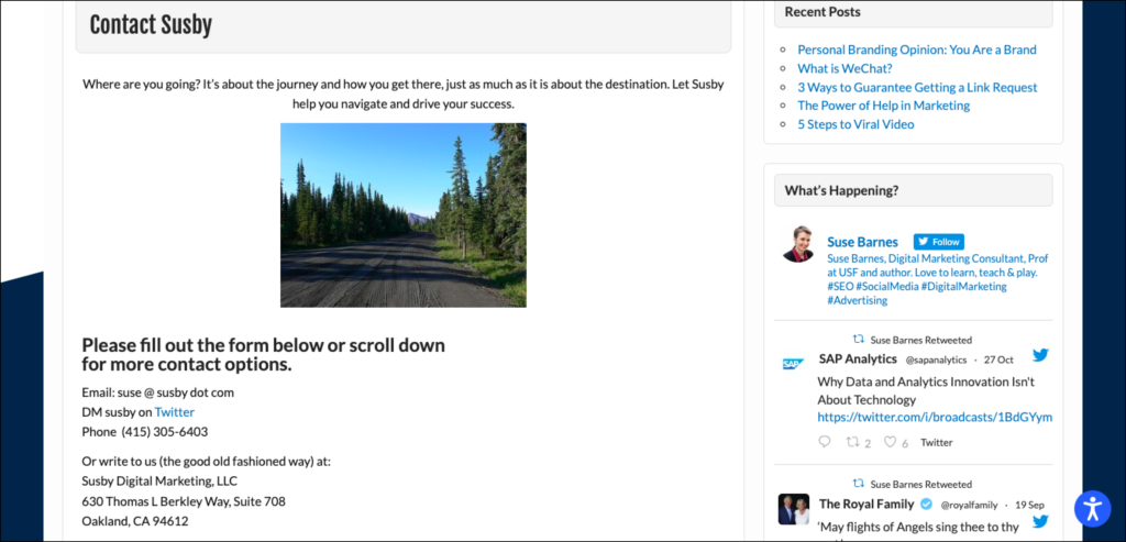
‘Contact us’ page
Before
After
UX WRITING
Retrospect: Looking back is looking forward
My role so far was to optimize the website’s content so that users can have a more improved experience. Following a content-first approach, while also considering the brand’s tone and voice, I ideated and wrote some microcopy options for buttons, as well as copy across different parts of the website’s pages where I haven’t provided artifacts. There were also various opportunities for improving current content and organizing them to fit the user journey and information hierarchy.
Content usability testing
I carried out testing to be sure the words are right for the experience and making the meaningful impact this brand wants to make.
Takeaway/Next Steps
The goal of this redesign was to improve content usability and continues to improve in that direction. I also hoped to make the design delightful and yet intuitive that things are where they should be.