After a decade of relentless touring and recording in all but complete obscurity, the Texas-bred/New York-based quasi-collective suddenly found itself held up by the press and public as one of the major figures in the jazz world. Snarky Puppy isn’t exactly a jazz band. It’s not a fusion band, and it’s definitely not a jam band.
Project overview
THE PRODUCT
Snarky Puppy is a digital product created to make album pre-order experience of Snarky Puppy fans more interesting and all encompassing.
PROJECT DURATION
May – December 2022
THE PROBLEM
Snarky Puppy fans and jazz lovers wanted a dedicated app and a more exciting platform to pre-order the albums of their favorite jazz ensemble.
THE GOAL
A dedicated mobile app for pre-ordering Snarky Puppy’s album and access to connecting with other Snarky Puppy lovers and jazz enthusiasts.
MY ROLE
UX/UI designer, UX researcher,
RESPONSIBILITIES
User research, UI design, wireframing, prototyping, Usability testing, Mockups.
Zooming in to the Users: User research summary
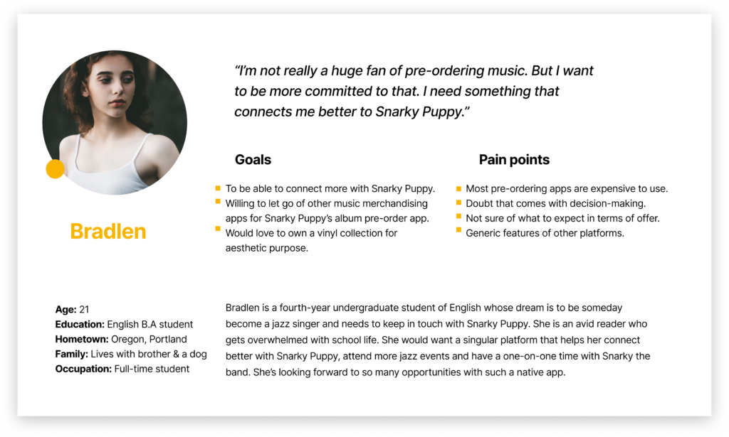
I used user interview and survey method of research. These methods enabled me to connect better with the target users of my digital product as well as gain more understanding of their needs, motivation and goals. A primary user group were generally young adults and jazz enthusiasts. The user group confirmed the need of a more encompassing mobile experience where community is prioritized. More so, getting this for free and flexibility was a priority.
I didn’t imagine that many users wanted more than just pre-ordering their favorite albums. At the end of the research, I was able to discover more insights into what users really wanted for this digital product. User interviews helped me in creating empathy maps, user journey maps, etc. I built problem statements, user journey maps, wrote user stories, and hypothesis statements based on findings from the research.
Questions: Highlights
What’s your favorite jazz band? I want to understand the experiences you face while trying to pre-order an album.
What frustrations have you faced in pre-ordering an album?
Are there features you’d want from an app of your favorite jazz band?
Can you describe your current favorite jazz band(s) and how you manage your time with career and keeping up with their releases.
What challenges do you face in earlier pre-order processes? How does this make you feel? Is there any way in which you feel these challenges could be resolved or made better/improved?
Painponts
1
Interest & Community
More connection to jazz
2
Market
So many competitors doing the same thing but a dedicated app will bring clarity
3
User flow
More features to connect and experiment with
4
Features
Quick, easy, more flexible album pre-order experience
User persona
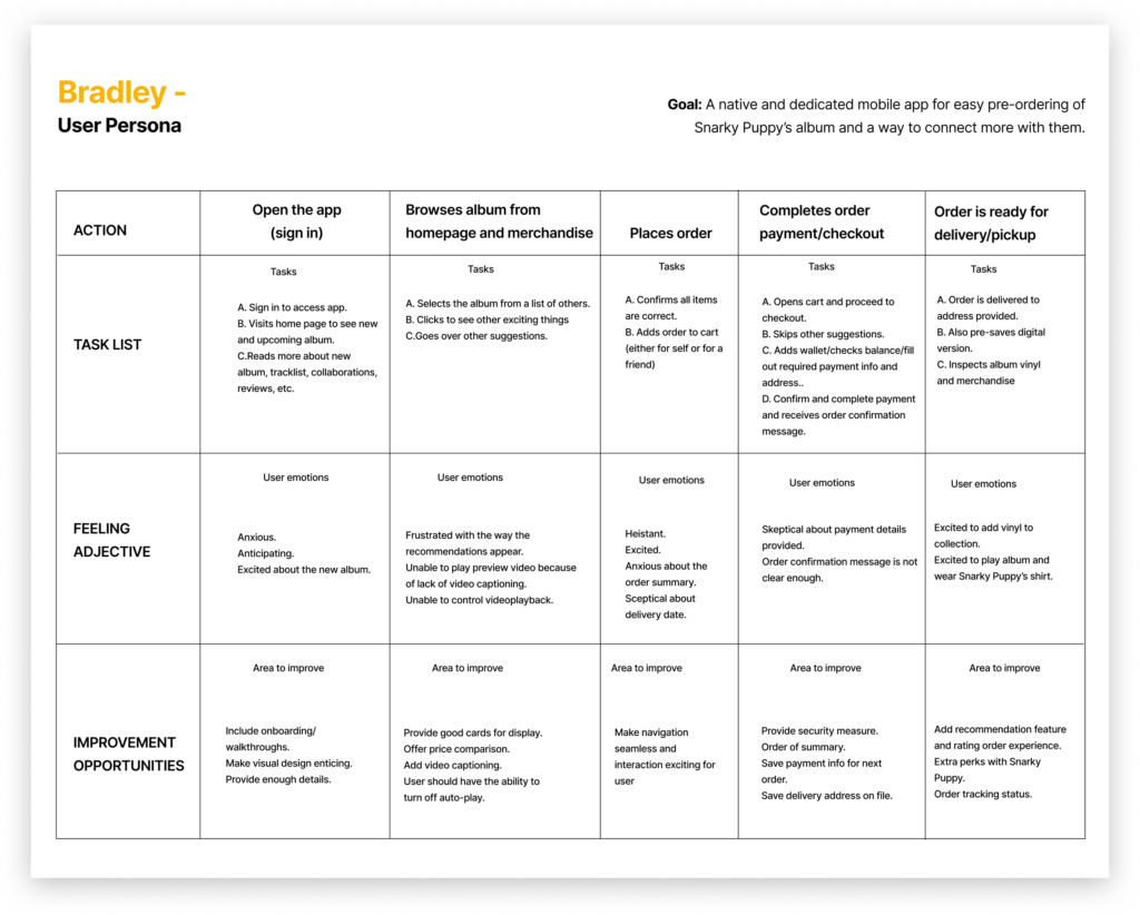
User journey map
Value Proposition
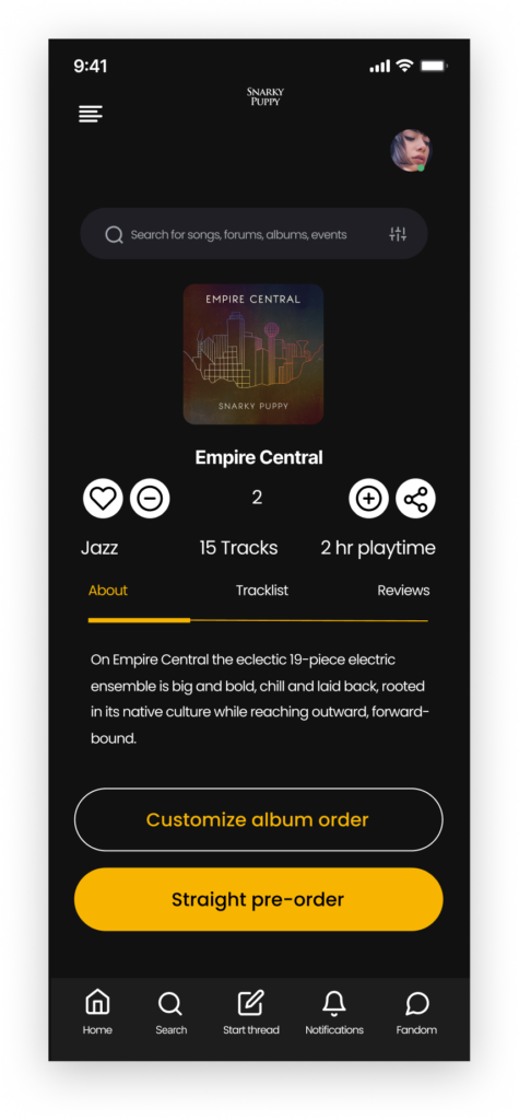
Early access to good music is high value, hence, the Snarky Puppy native app is very useful because it is a native app that will be personalized for lovers of jazz and fans of Snarky Puppy to be able to pre-order albums conveniently.
“I like vinyl. I love it for aesthetics.”
“I’ve never owned a vinyl collection. Not sure if contemporary songs still come in vinyl. If so, I will be able to pre-order that if possible. That will be my motivation.”
“I’m new to jazz. But I love Snarky Puppy. The interesting thing is that does it make me sense. I can feel it in my body. It moves my soul.”
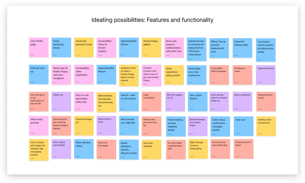
Thinking: Ideation, Clarity and Perspectives
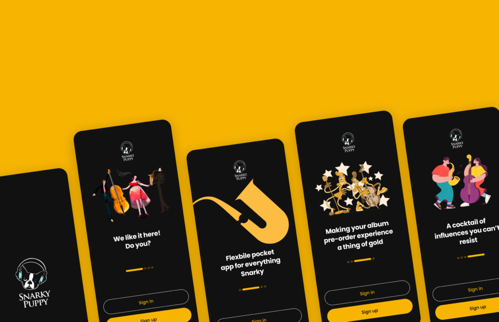
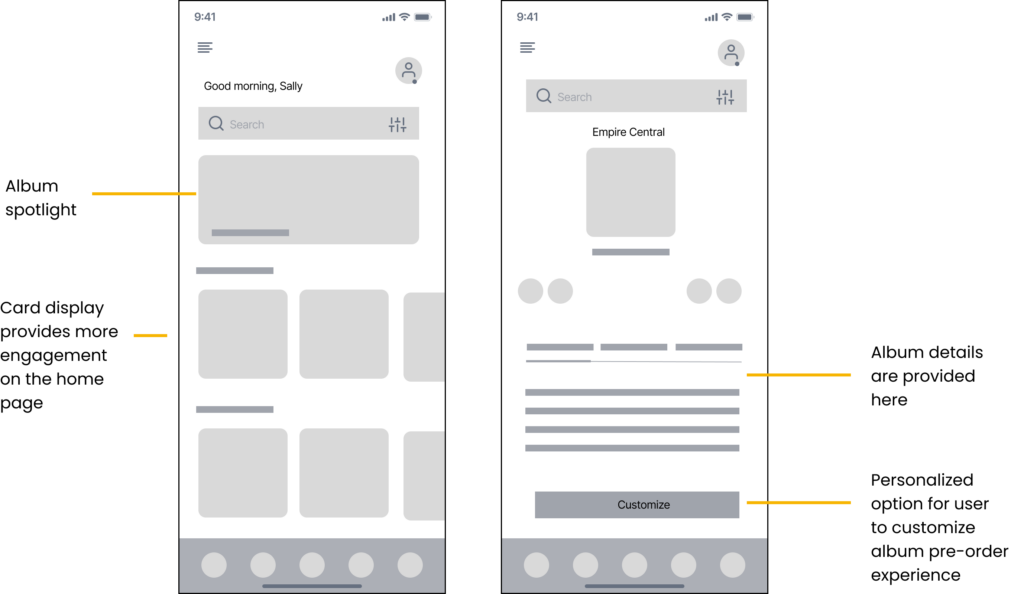
Digital wireframes
Iterating on selected screens of some design solutions through digital wireframes created the structure of what would become the final design
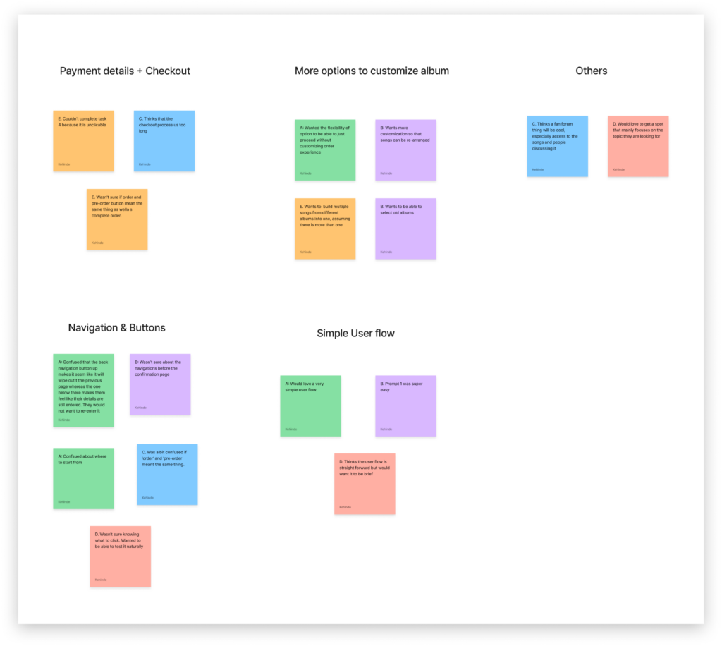
Affinity maps
Summary of Insights
“Give me an option to buy now or customize. I didn’t like having to go through the customization process if I didn’t want to.”
“Buttons need to be reduced. You have a button that says ‘place order’. That can take you to a page that says: ‘check out’”
“I can easily see how to order in the app but I’m not sure if there’s a difference between that and preordering. If an order is a pre-order I think the confirmation page should clearly say so. Or the button itself should say pre-order.”
Usability study: Summary of findings
Round 1 findings
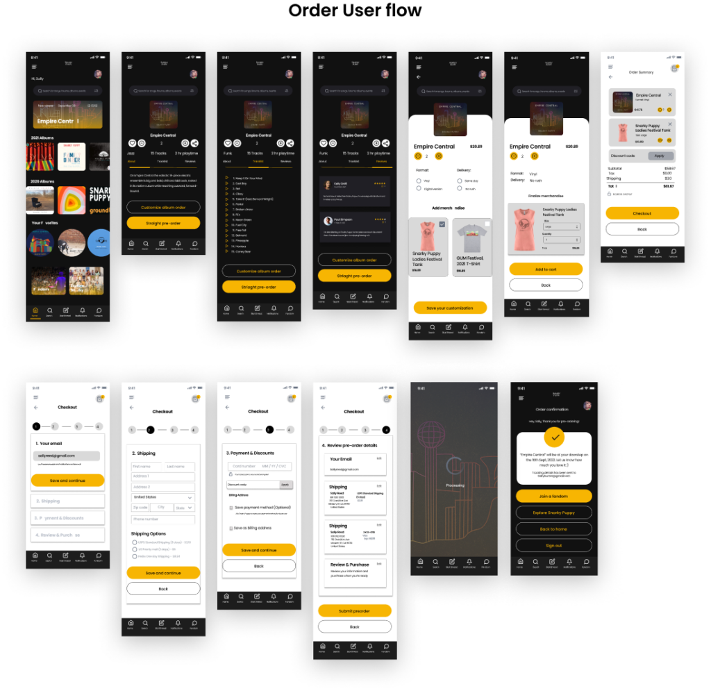
Users wanted a shorter user flow.
Incorporating merchandise.
Customizing album experience wasn’t a top priority for users.
Users wanted the capacity to be in control of their pre-order.
Possibility of saving order details and the ability to preview album tracklist.
Round 2 findings
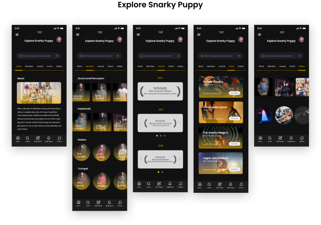
Users wanted a more engaging home page. Users wanted more profile details and expansion.
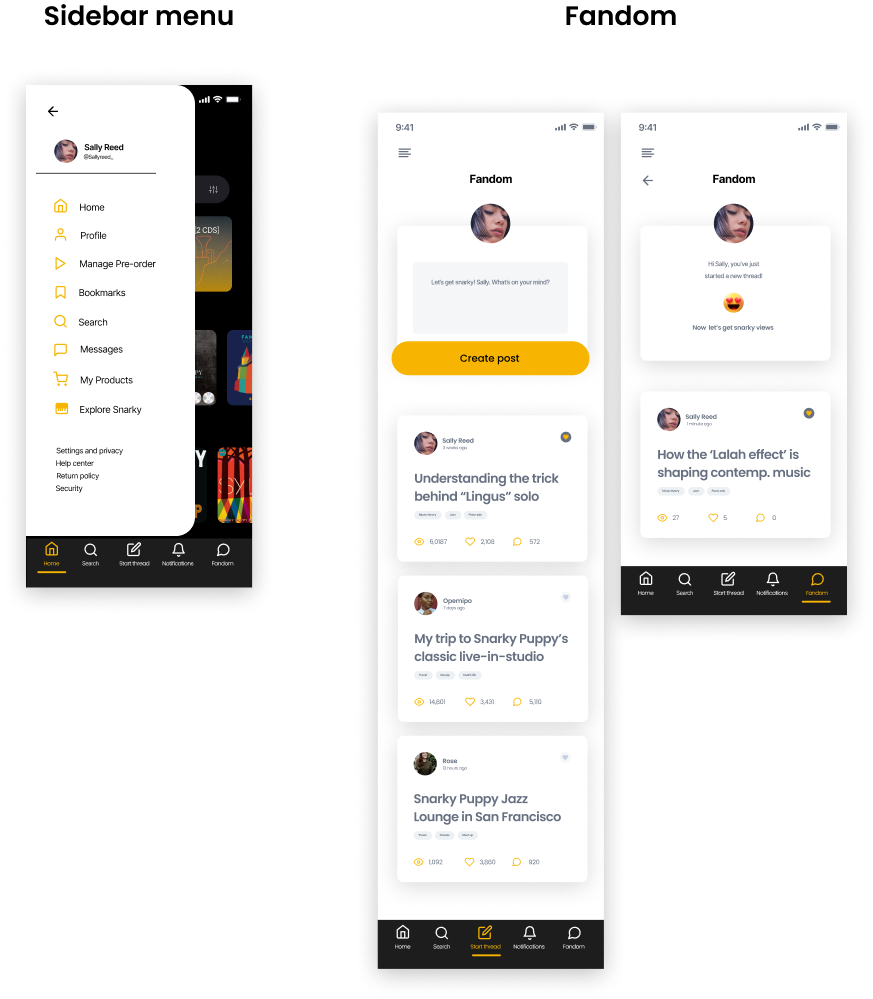
People wanted more access to the fandom feature.
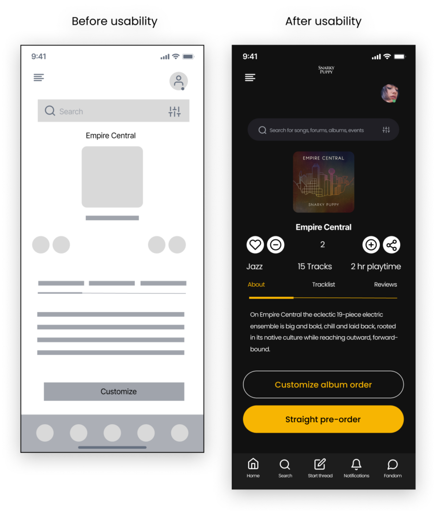
Usability tests: Outcomes
1 Before usability test, early design concept had a more complicated user flow. Users wanted the possibility of quick, easy checkout.
2. Before usability test, users using the early design concept users must compulsorily customize album. But many just wanted to pre-order straight away skipping the much longer process.
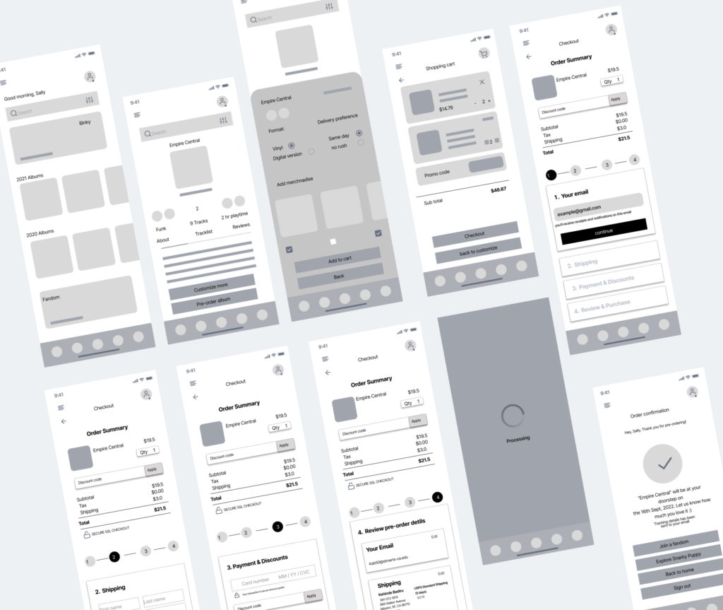
High-fi mockups
Accessibility Considerations
1
Consistent visual design elements are used in order to create ease-of-use
2
Users can pause playback or play at will
3
Icons and high resolution visual images are used to make navigation easy
The color contrast, size of buttons and typeface.
Takeaways & Reflection
This app will make the album pre-order experience of Snarky Puppy listeners more enjoyable. “I’m more connected to this band than ever and can access them better.”
learned a lot from iterating and immensely putting the user front, end and center.
Next steps
Get more feedback from tests.
Refer back to KPIs as a way to measuring usability and functionality.
Keep on iterating and finding more opportunities for improvement.