Susby is a marketing agency, based in the SF Bay Area, offering marketing and social media services. Their goal is to connect businesses to their target audience. They provide customized strategic solutions to get business owners and their businesses to make the most informed decisions.
Design Problem
Their website is struggling to communicate to their customers what services they offer. As a marketing agency that thrives on driving web, search, and social media marketing, a website that fulfills that and makes it easy to deliver on those terms is required. I think of a website more interactive, optimized, and organized, making it easier for users to get whatever services they need.
Their website should communicate diectly and better help (new and returning) customers get to where they want to be. The challenge here is to redesign an experience that addresses this.
Let's get it out of the net: A website re-design
My focus here, and ultimately, for the entirety of this project is not to focus on what’s not working but on what is and can be better. In searching for ways to turn limitations into design opportunities. A modern, yet simple website would really aid Susby in telling their own story and furthermore help their clients tell theirs. The brand voice would be strengthened with a more organized system.
Design goal: A re-design of the website that makes navigation easier, and experience, more -friendly for improved user experience.
PROJECT DURATION
August – November, 2022
MY ROLE
UX Designer and UX Writer
RESPONSIBILITIES
Conducting UX research, UX writing, UI design, Paper and digital wireframing, Low-to-High fidelity prototyping, Interaction design, Usability tests, and iterating on findings.
TOOLS
Google Docs, Figma, Pen and Paper
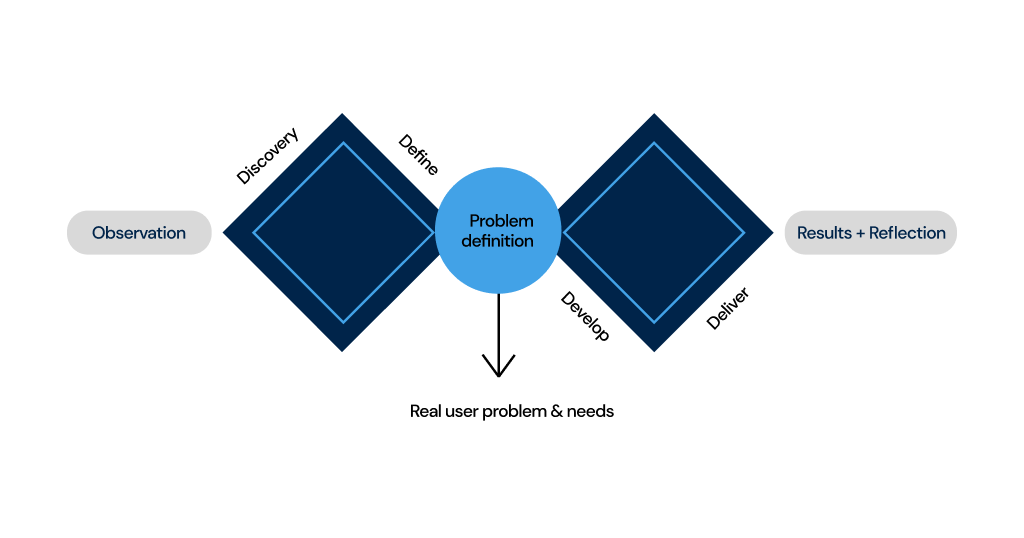
Discovery phase: Focused on understanding the main problems, user pain points, business requirements, and how to approach them. Some deliverables: user personas, information architecture, wireframes, site audit, content design, documentation, sourcing inspiration, business thinking, and UX writing.
Delivery phase: Implemented cohesive design solutions, sourced from ideation, and refined through iteration. Some deliverables: interaction design, high-fidelity design.
Discovery Phase
Every great thing starts with one careful looking. I was frolicking on the internet some time ago looking for digital agencies in the SF Bay Area. I found some whose websites, work, and vision were inspiring. Each of them had a unique identity, and a clear-cut passion for growing brands and helping businesses tell their stories in different unique ways. For marketing agencies to effectively tell the stories of their customers, they need to also tell theirs.
I found Susby’s website and this discovery of the earlier mentioned problem statement necessitated a design challenge, a design decision validated by user research. From observation, it became necessary that my potential design solution should go on to be influenced by insights gained from research, armed with user input. I discovered an opportunity for re-invention and improving upon current standards.
Defining the Obvious
Re-defining experience starts with understanding. To move forward, it was important to understand what Susby’s business goals were, their customers and their pain points, frictions faced, motivations, needs, and specific goals.
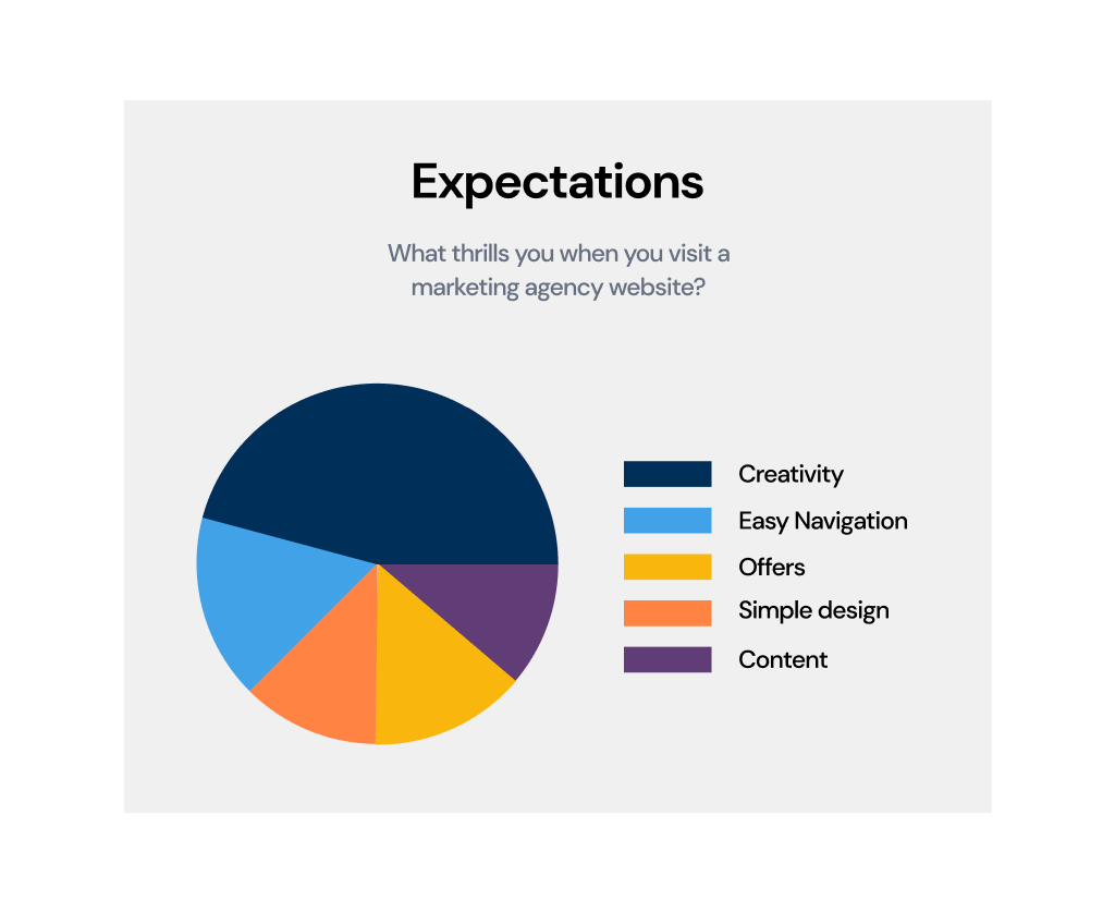
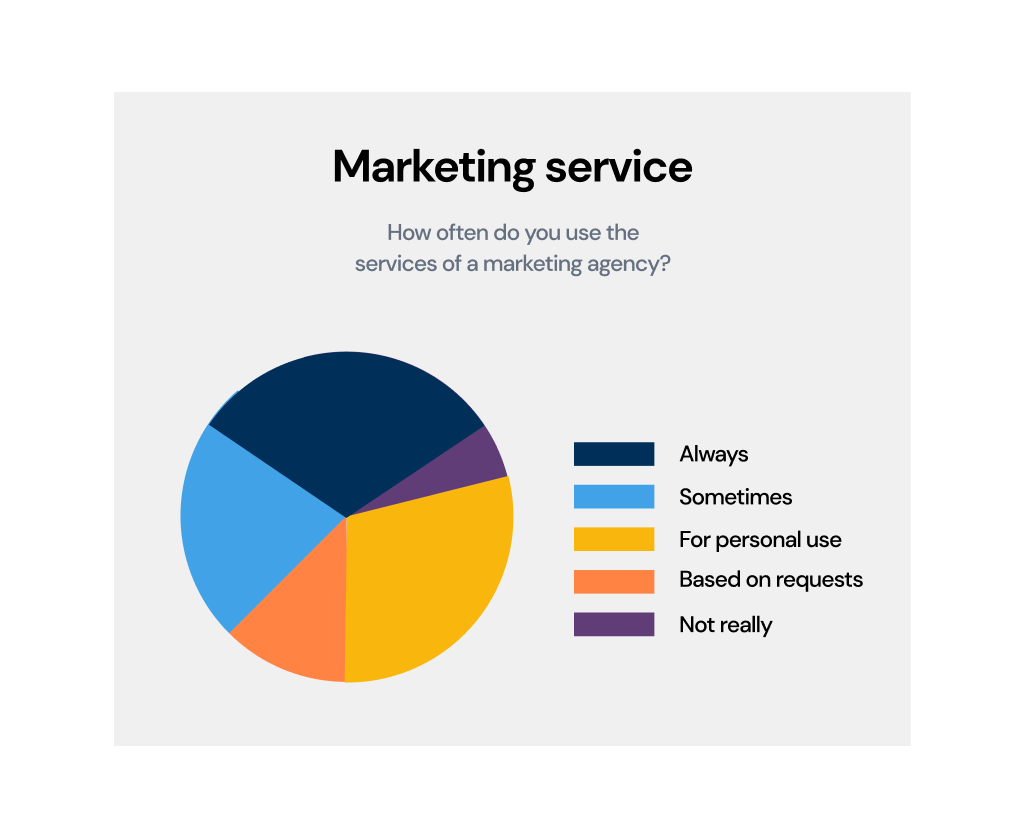
Fast facts
Consumer behavior changes and is inspired, constantly by the product being accessed. This makes layout and content redesign for Susby important.
The appearance of marketing websites influences conversion and customer experience changes depending on the goals being reached. CTAs, headlines, and content design would address this.
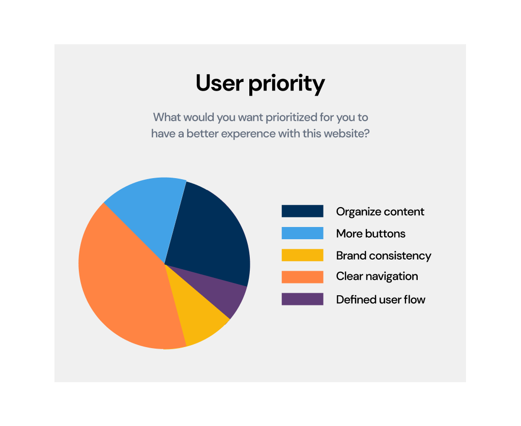
64% of purchasing decisions of customers rely on blogs than newspapers (which makes the blog page re-design necessary).
Viewers retain 60% of what they see but only 20% of what they read (which explains the need for visual composition).
While user interviews enabled me to gain more perspective from the users, the survey validated these results. These metrics were used to arrive at a hypothesis and testing to see if the pain points already established will be justified.
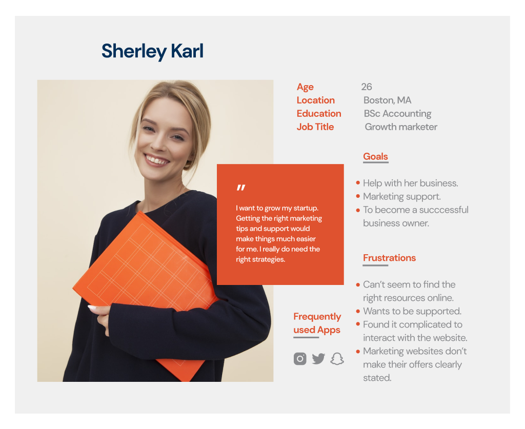
User persona
User Pain points:
It is worthy mentioning that some of these pain points do not hinder the user from reaching their goals but stifle interaction and perhaps put the user on a not-too-happy path. I wrote out the problems my interview participants had when they visited the website on their mobile and PC devices and what their experience was like. Insights gotten from the interview were:
Through design thinking and documenting the insights, product innovation that puts the user and solutions at the center is a successful one.
Turning insights into opportunities
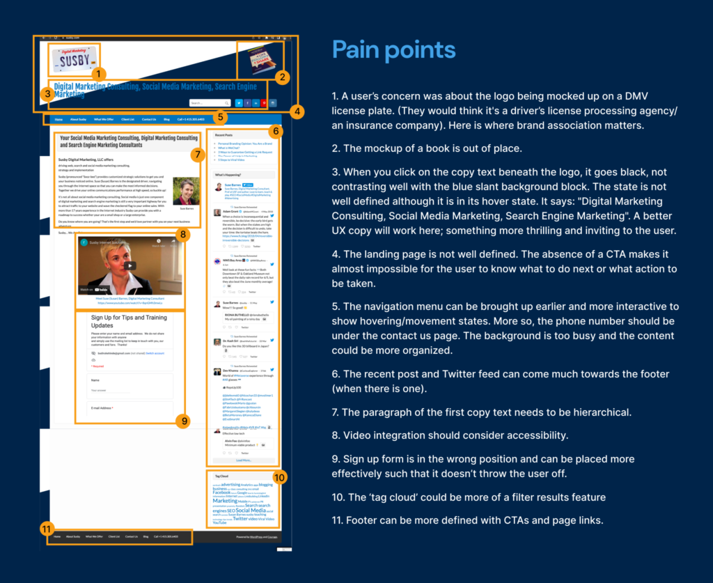
1
For a homepage, there’s too much text and the information presentation is a bit overwhelming. The video is very useful and can be more front and center.
2
Reduce the amount of text, or break out the text into smaller, digestible statements. Provide an obvious actionable element like a button, so someone who’s interested can take the next step easily.
3
Responding to why branding is important: What’s offered is most important yes. But the brand is important for attracting new clients.
4
Page flows needs to be more consistent. The navigation and layouts could be better improved.
Competitive audit & Market survey:
Anticipating problems users might face is a step towards defining the problem statement, and addressing these pain points. I conducted a competitive audit after I had visited other marketing agency websites like jstokes.com and Howfunworks.com
One thing I noticed as a design opportunity with each of them was consistency, a minimalist approach, great visual design, content layout, and interactivity that would at first glance, draw the visitor into wanting to explore the website. These, I thought were some of the reasons that contribute to effective user experience as well as helping businesses achieve conversion and retainment. This would be a win-win for the user as well as for Susby.
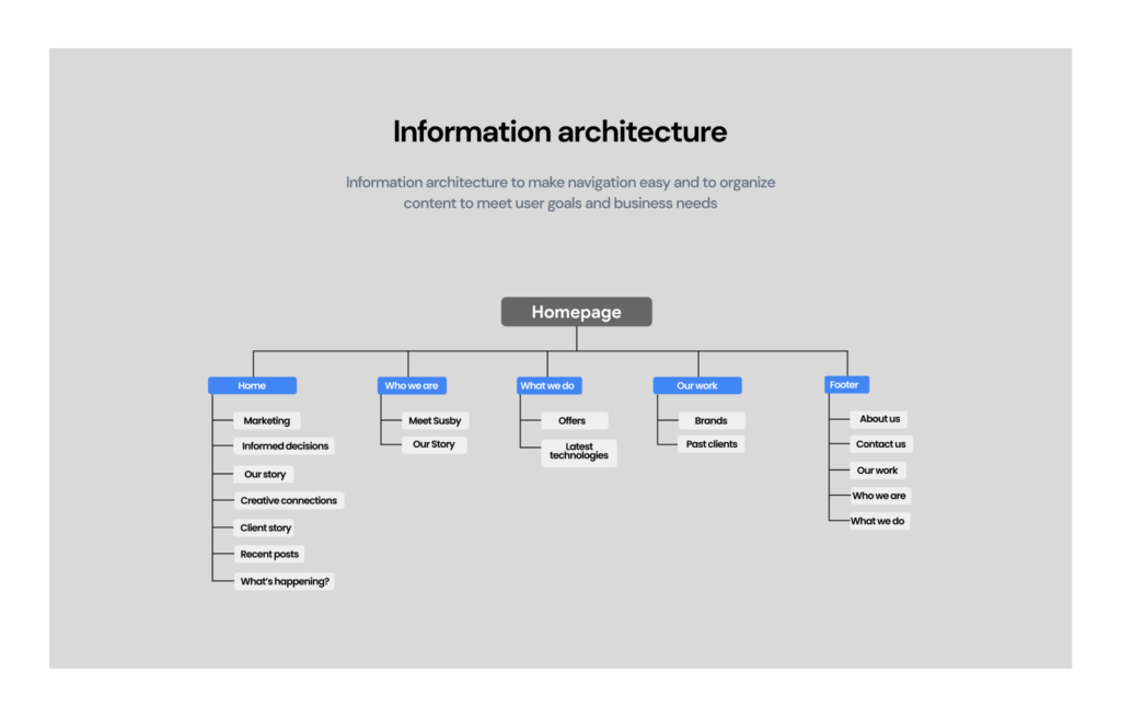
Information hierarchy
Developing and Mapping out relevant product solutions
Since I’ve understood best practices in the digital marketing industry and defined metrics, I began processing how long the project would take and how my documentation will be more effective. I documented primarily on Google Docs, and sometimes in my head as I took walks. In addition to thinking of how the pages will look and function, I began curating wireframes.
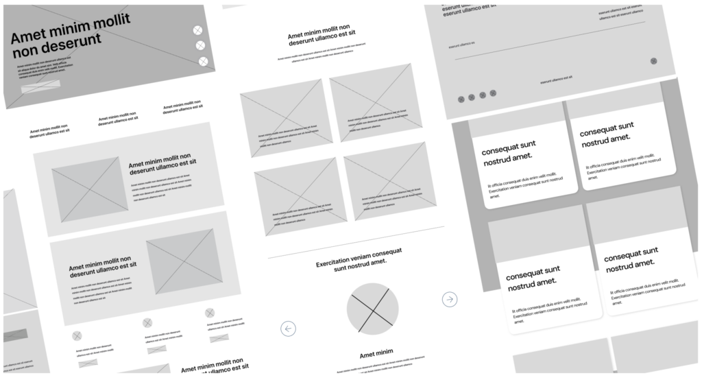
Wireframes: Each page was refined, and content developed, layout was organized so that users can scan through things quickly.
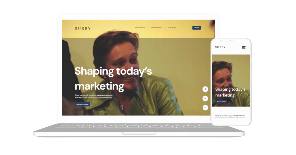
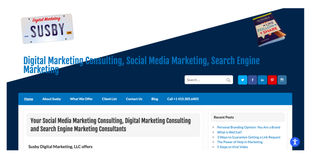
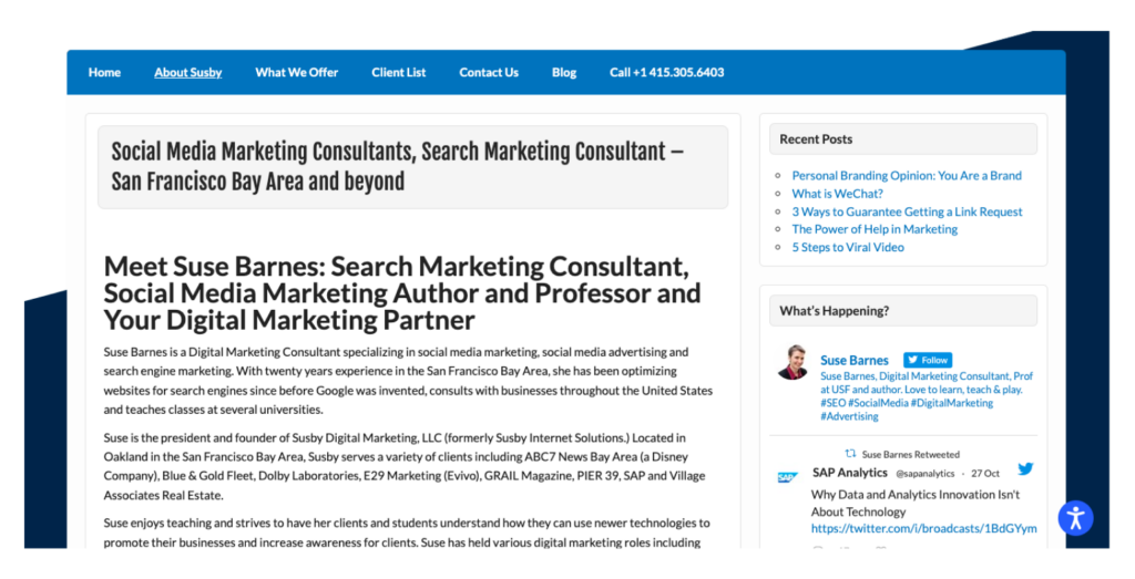
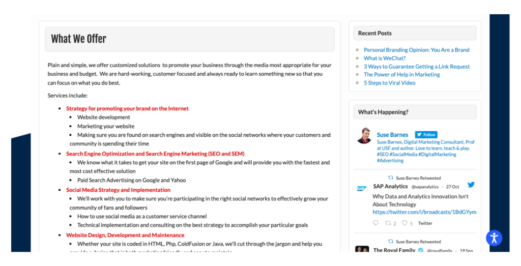
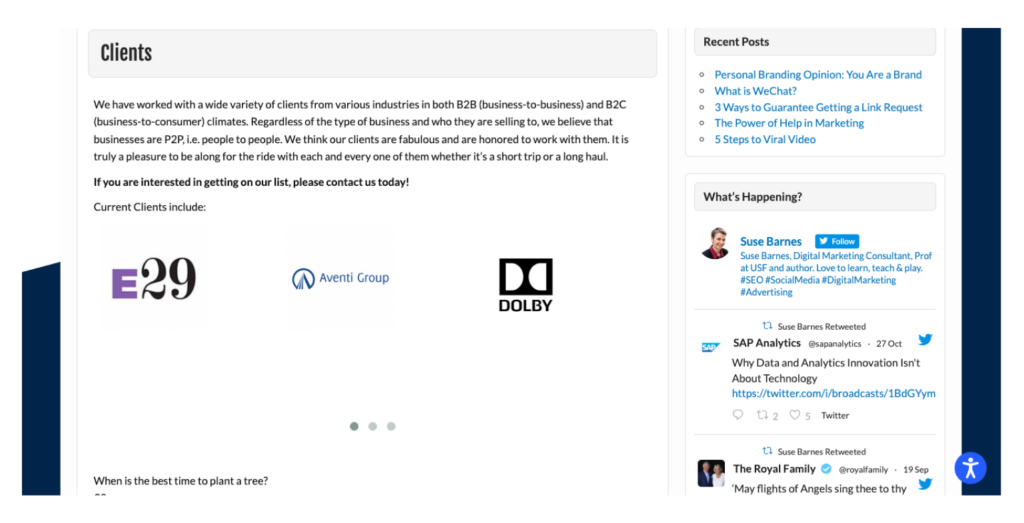
Screenshots of the current Home page, About page, Services, and Clients page
Digital wireframes
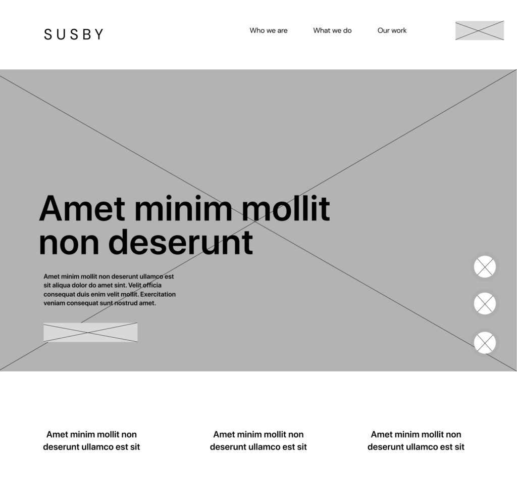
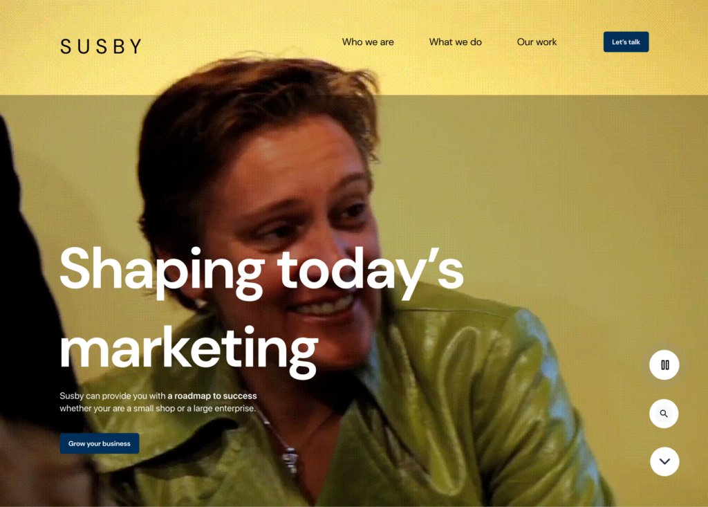
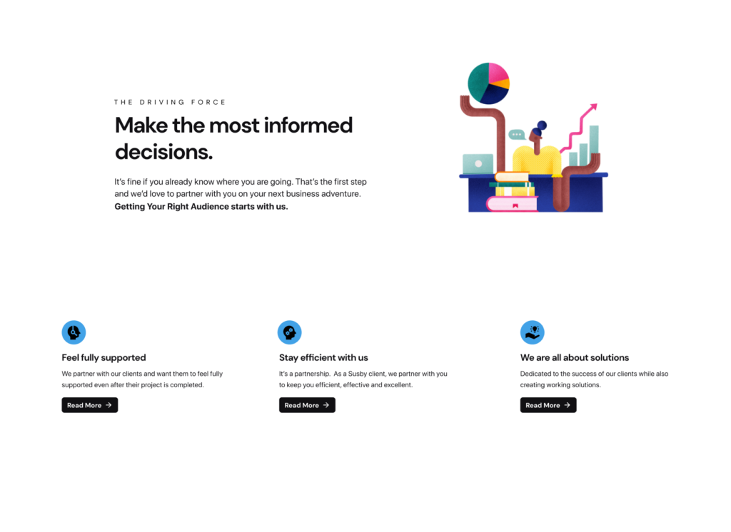
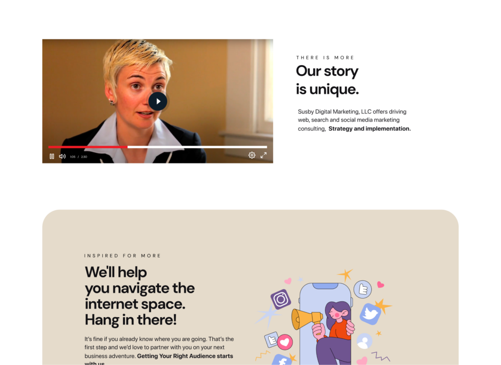
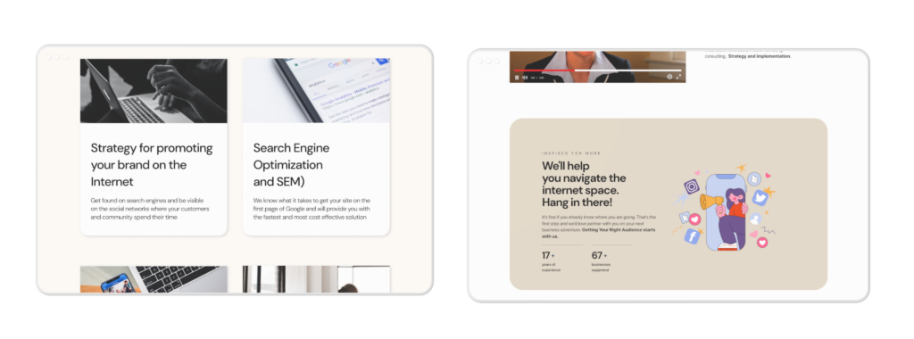
Optimized landing page to include accessible Video playback, Defined menu navigation, Headline, and primary CTA to increase conversion, and Layout revamp.
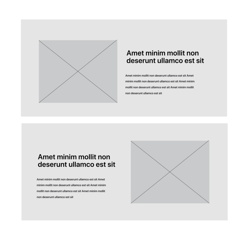
Implemented new content blocks that tell the story of Susby and keep their target customers interested in moving forward.
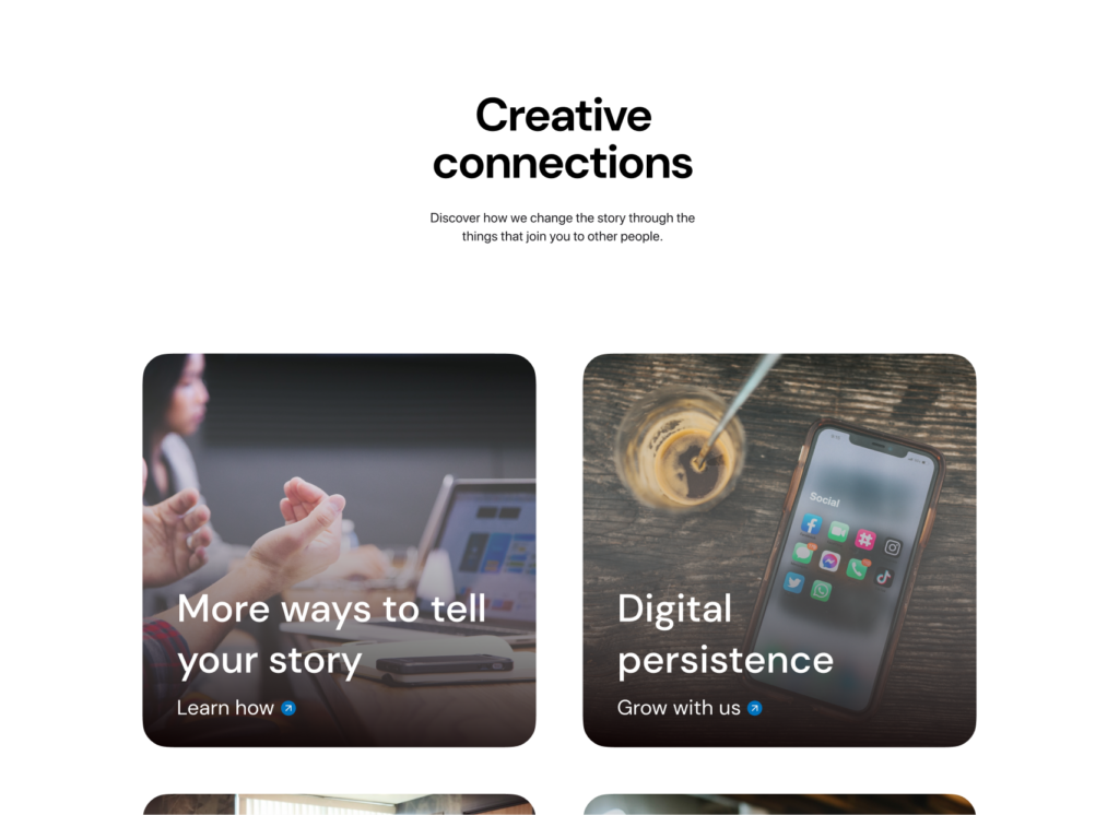
More ways to establish creative connections between Susby and their customers
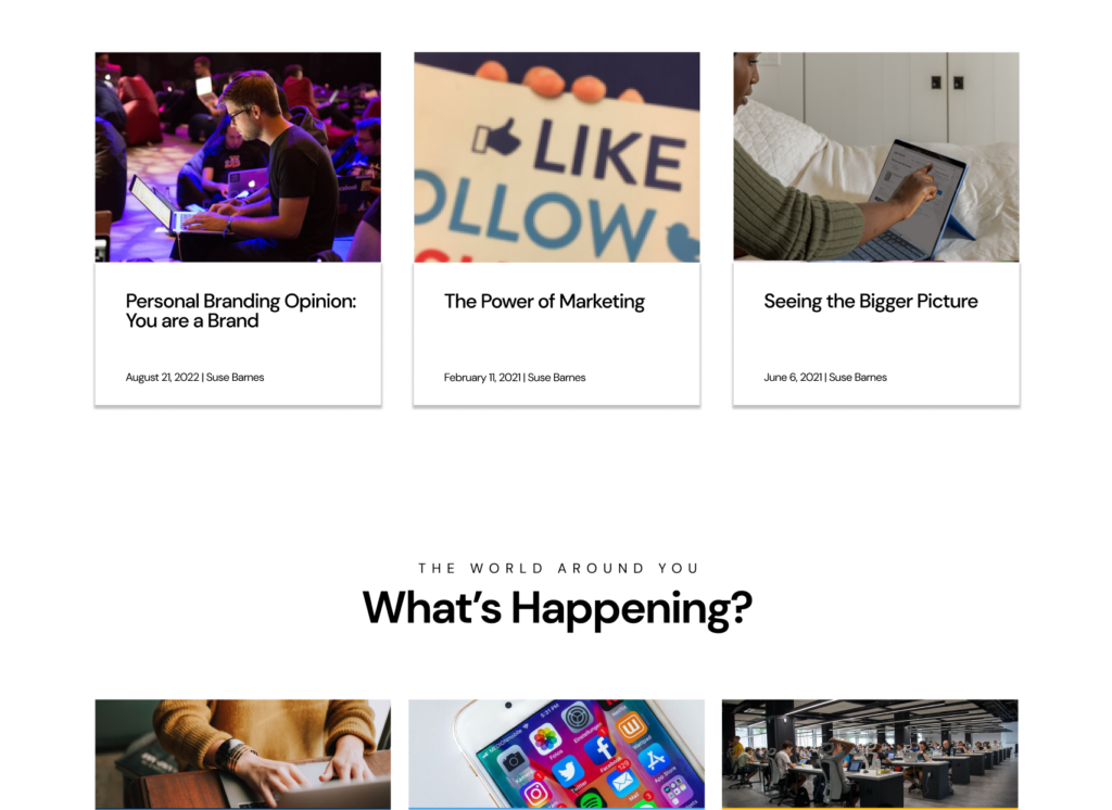
Integrated blogposts and social media feed visualized on a redesigned layout.This is an opportunity for users to understand more about Susby and discover more business opportunities.
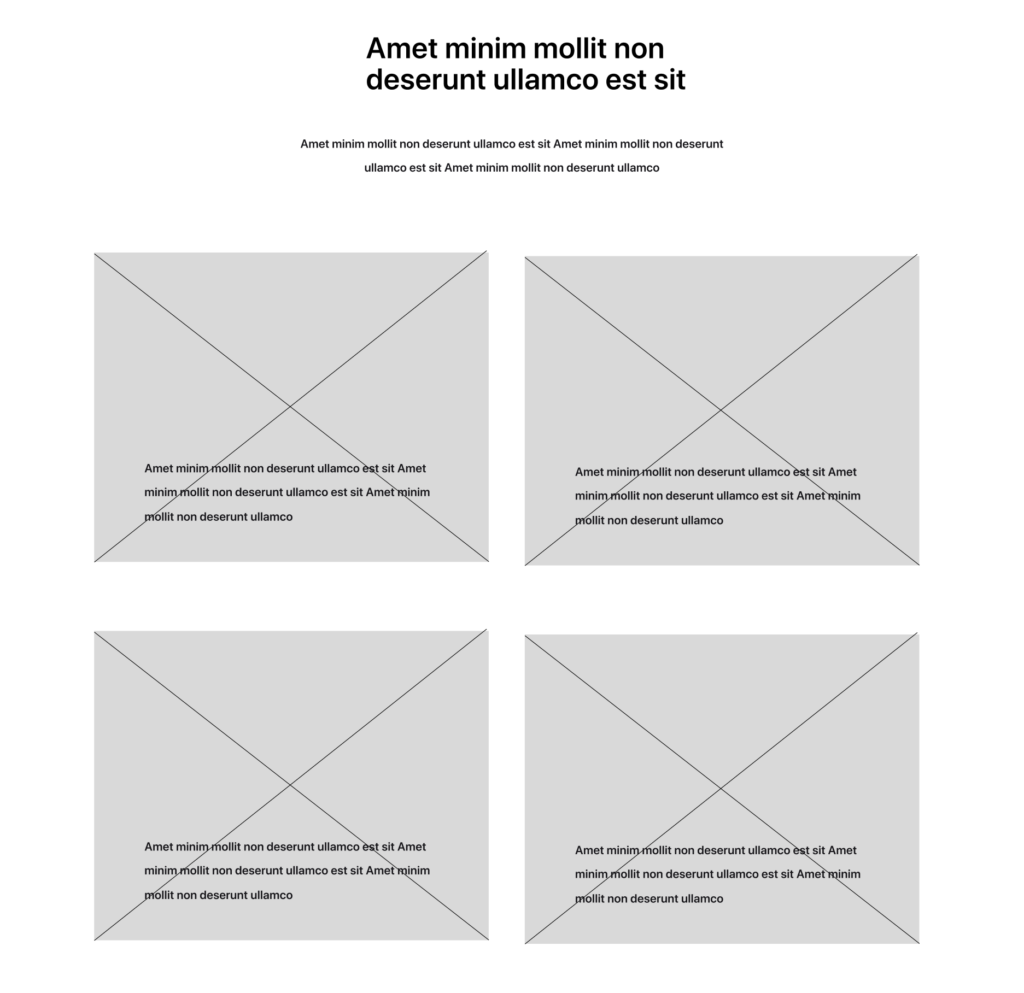
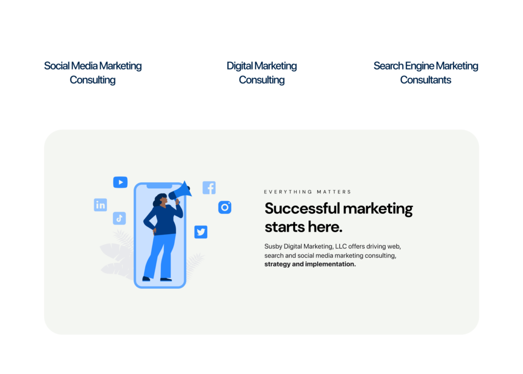
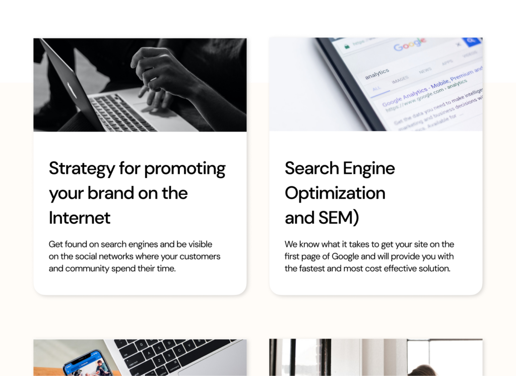
What Susby offers are spotlighted with these cards and given a more distinct position in the ‘what we offer’ page.
The design challenge was to create something that addressed these user pain points and insights curated from research. The goal, primarily was to make the pages more organized, and aesthetically appealing while also making navigation easier and information hierarchy clear. Thinking like a designer is thinking of simplicity. I also anticipated edge cases and ensured users will not have likely obstacles in their process of using this redesigned website.
Beyond deliverable: Spotlighting what was done and solutions implemented
Some core design decisions:
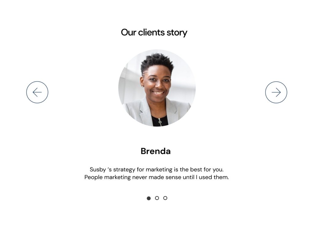
Having a testimonial block which serves as social proof.
Highlighting the offerings and benefits for new and returning customers,
Integrating videos also improve engagement, increase interactivity, and immersing users in the product.
Incorproating recent posts and Twitter feed
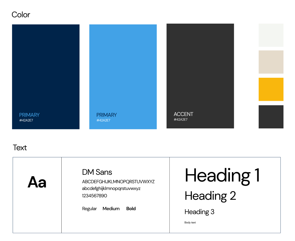
To improve accessibility, design hierarchy, typography, images, illustrations, and icons were used.
On-brand choice of color to improve engagement.
Gestalt principles were core to the choice of utilizing cards.
Generally, as much as prioritizing the user needs is core, these design choices will help users get to places on the website quickly and meet the business goals.
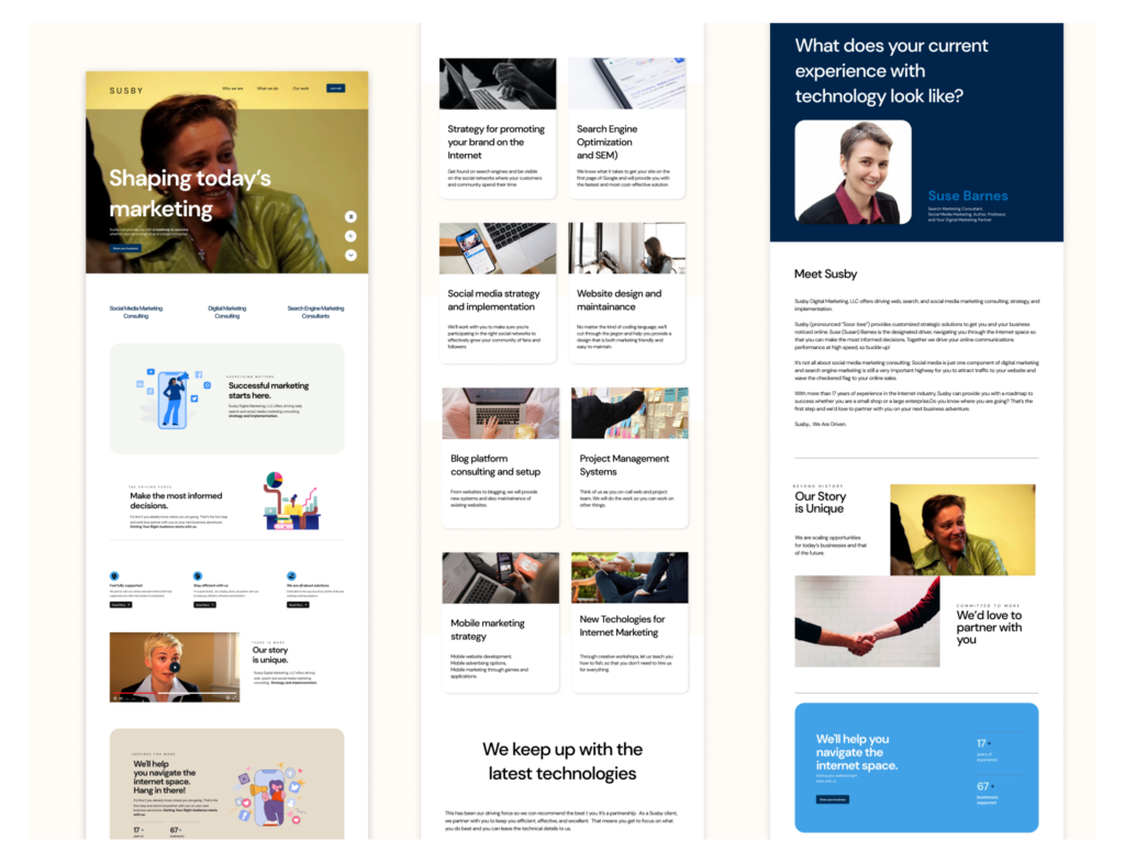
The pages now redesigned would be Home, Who we are, What we do, Our work, and Contact page.
Optimized landing page to include accessible Video playback, Defined menu navigation, Headline, and primary CTA button to increase conversion, and Layout revamp.
Implemented new content blocks that tell the story of Susby and keep their target customers interested in moving forward.
New testimonial content block. Current website does not have that integrated.
There are many important solutions and services being offered by Susby that weren’t given enough attention. The use of cards would direct customers’ attention toward them.
High-fidelity design of integrated blog posts and social media feed. Since there is enough content-real-estate, this is an opportunity for users to understand more about Susby and discover more business opportunities.
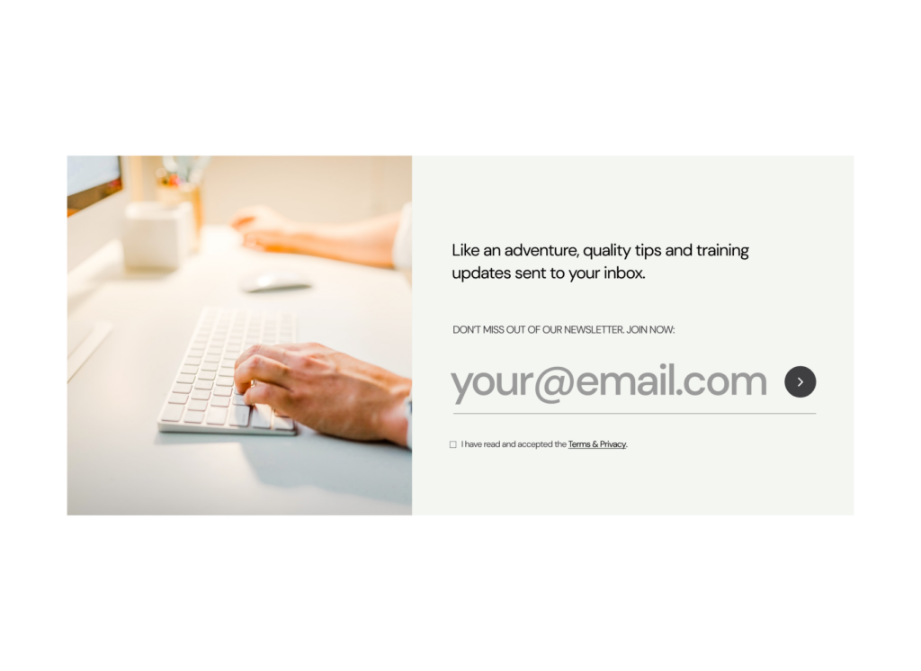
Redesigning the newsletter subscription form would enable Susby to nourish loyalty and keep up with retention. It also sells. As against the form on the current website, this is simple, and provides a good decision-making opportunity.
Hi fi pages
UI Style guide
UX Writing opportunities
My role here was to optimize the website’s content so that users can have a more improved experience. Following a content-first approach while also considering the brand’s tone and voice. I have a dedicated portfolio for this.
Full prototype
Affirming and confirming opportunities
An unmoderated usability testing was conducted with three participants in order to test the current prototype and get useful feedback and reiterate solutions for a meaningful user experience as users interact with the product. The highlight of the testing was the users’ need for some buttons to be increased in size as well as contrast improved.
Takeaways/Next steps
Every design provides an opportunity for improvement. The goal of this re-design was to improve usability and continue to improve on that along with other possibilities. I’m open to more possibilities and opportunities for improvement.