UX is everywhere — in our lives even when we don’t notice it. I often find myself poking around and deliberately misspelling URLs so I could land on 404s.


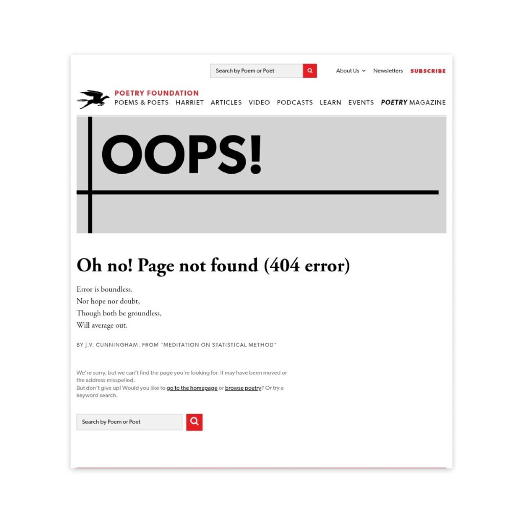
One of such content adventures is my encounter with my fave, Poetry Foundation. Here’s a quick exploration into their Error 404 page, and why this is successful in every UX metrics you can think of.
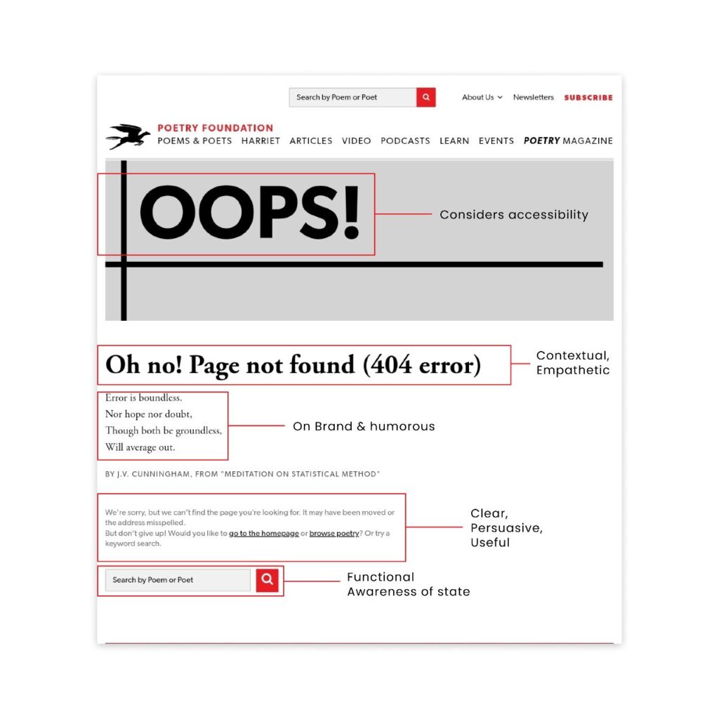
The headline clearly immediately creates an awareness of what’s happening. It is well-emphasized and provides context to the situation. The poem referenced helps Poetry Foundation stay on brand while also achieving brevity.
This poem (an excerpt from a longer poem by J. V. Cunningham) does two things: utilizes humor as well as being conversational, offering hope in a genuine way.
The user (in this case, the reader) gets more clarity and is reminded that errors like this happen. It is not uncommon. More so, they should not give up. With the description below the poem, Poetry Foundation successfully builds trust with its readers, offering more value through clarifying navigation options: go to the home page or browse poetry.
Alteratives are specific to each reader and they have the luxury of choice. This is done subtly in form of a request that is admirably intentional and conversational too.
The accessible search functionality at the end returns the user to the primary action that brought them there in the first place.
Great microcopy makes experiences intuitive and meaningful to its end users.
_
Give this a 👏 if you loved reading. I follow and write about stuff in UX Writing, Content Design, and UX/ Product Design. Let’s connect on LinkedIn.